Node Configuration Drawer
In the node configuration drawer, the system consists of three sections:
- General – Includes general information and basic settings for the agent node.
- Tools – Used to perform functional tasks or interact with external systems.
- Advanced – Used to customize input and output guard settings.
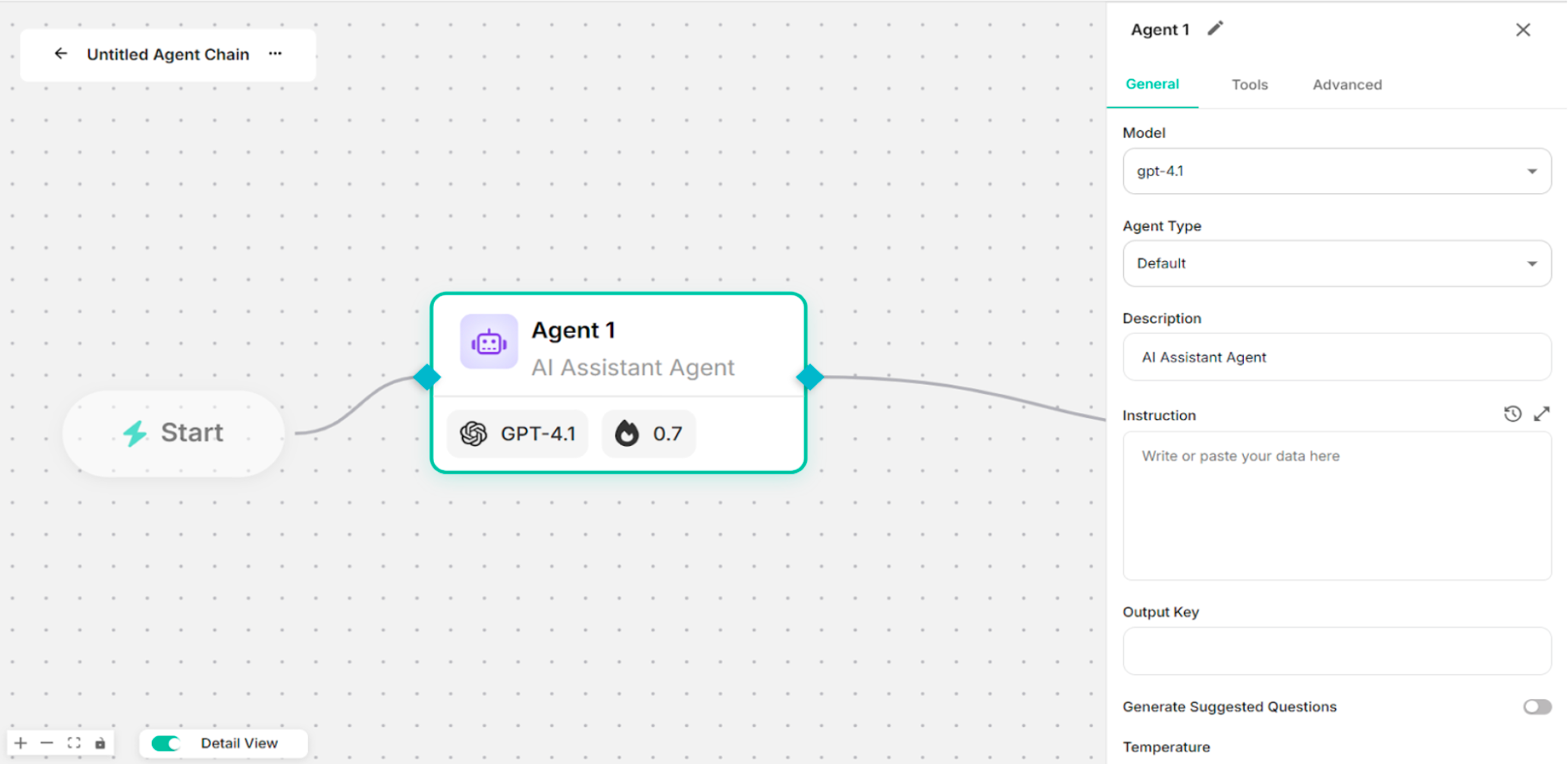 Figure: General Node Configuration Drawer after clicking on the Agent Node
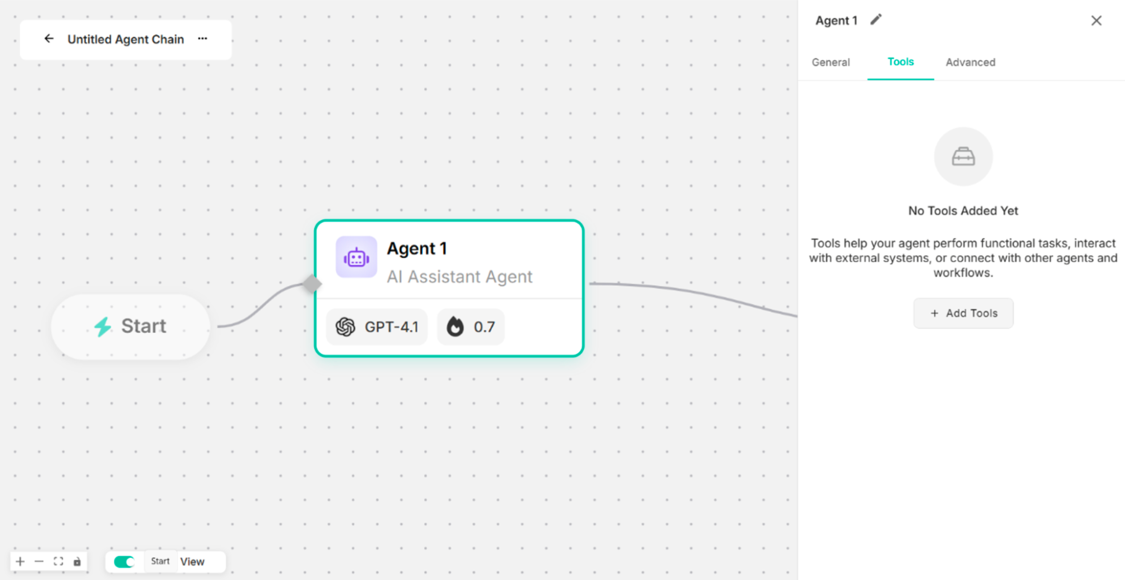 Figure: Tools Node Configuration Drawer
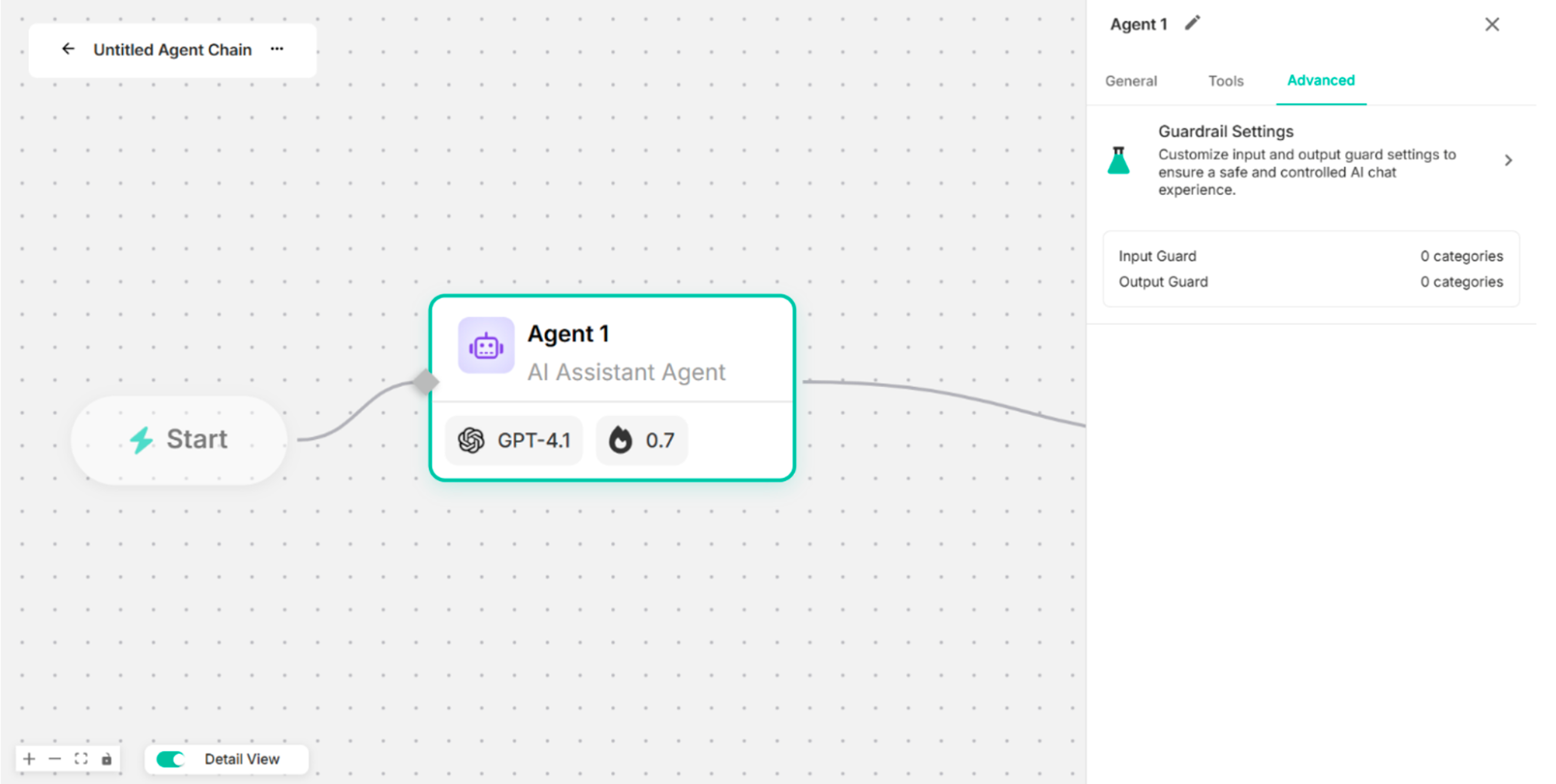 Figure: Advanced Node Configuration Drawer
4.1. General
| Fields/Settings | Description |
|---|---|
| Model | To choose the Model |
| Agent Type | To select the Agent Type |
| Description | To identify the agent's purpose within the workflow. |
| Instruction | To define how the agent should respond and perform tasks |
| Output Key | To specify the key under which the agent's output will be stored |
| Generate Suggested Questions | To enable or disable automatic generation of suggested questions |
| Temperature | To control the creativity of the AI Agent's responses. |
| Max Output Tokens | To define the maximum number of tokens the AI Agent can generate in a single response. |
| Top P | To control response diversity using nucleus sampling |
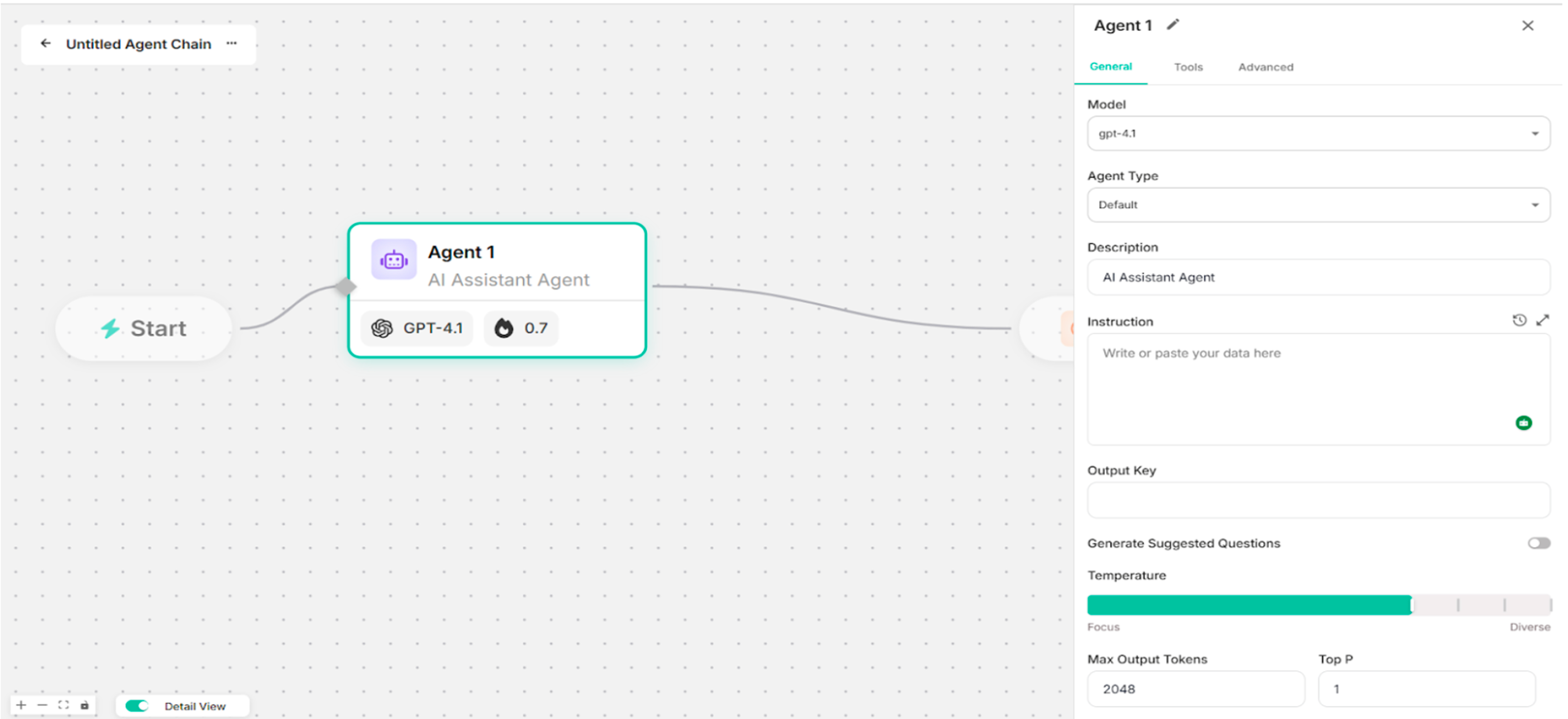 Figure: General Section of the Node Configuration Drawer
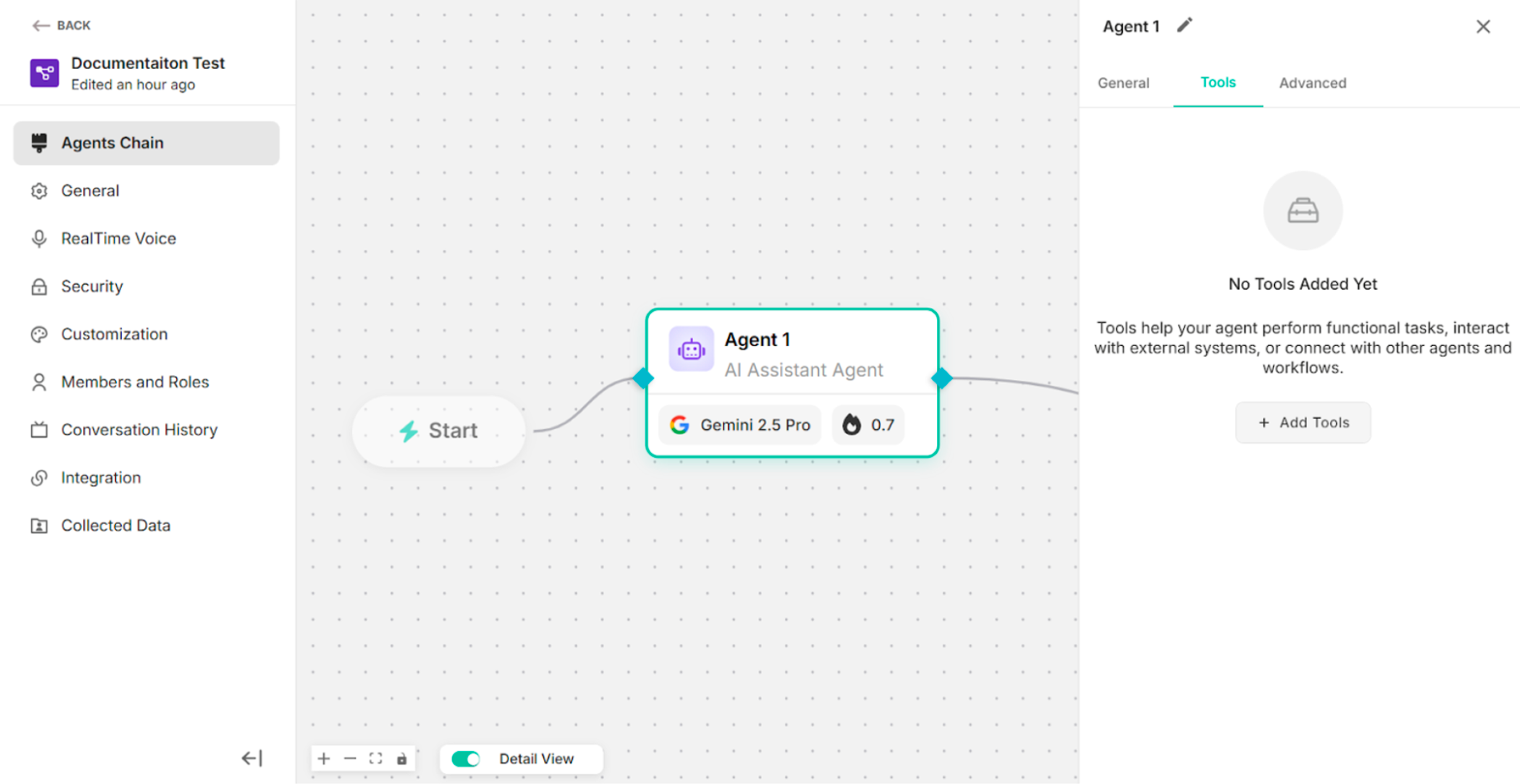
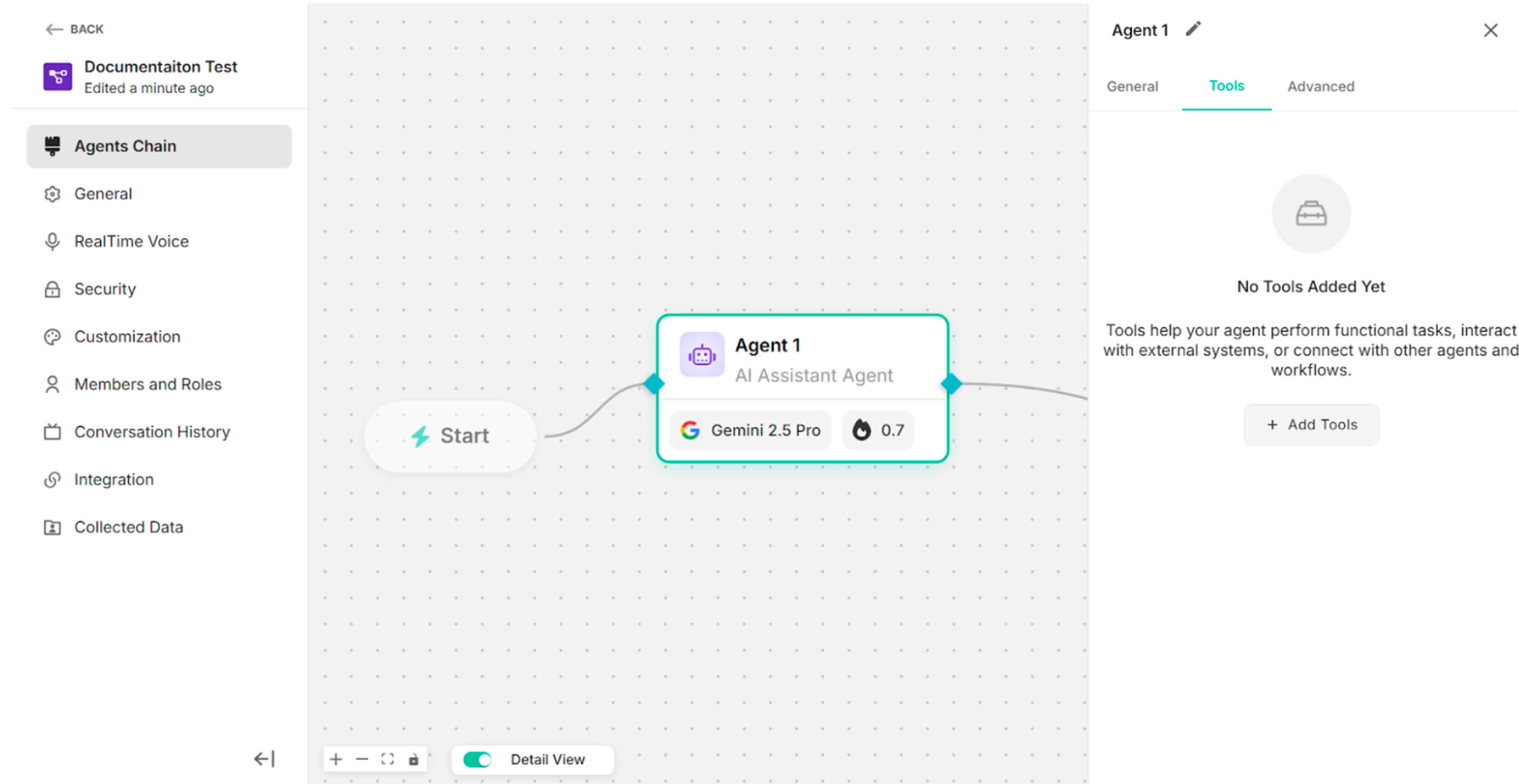
4.2. Tools
The "Tools" section is composed of three main components:
- System – Built-in tools provided by the platform.
- Custom Actions – User-defined tools for custom logic and integrations.
- MCPs – Tools based on the Model Context Protocol for advanced agent communication and orchestration.
-0651e7df872cc5e853ca226dec008e08.png) Figure: Add Tools Pop-up Box (Default)
Figure: Add Tools Pop-up Box (Default)
4.2.1. System
| No. | Tools Name | Description |
|---|---|---|
| 1. | RAG Tool | To retrieve relevant information from external knowledge bases. |
| 2. | Web Search Tool | To fetch real-time information from the websites. |
| 3. | Custom MCP Tool | To integrate custom tools or services using the MCP (Model Context Protocol). |
| 4. | Code Executor Tool | To perform calculations, and downloadable file generations. |
| 5. | API Tool | To interact with external APIs by sending requests and processing responses. |
| 6. | Database Tool | To retrieve, and manipulate data from connected databases, supporting structured data access. |
| 7. | Context Aware Tool | To handle post-login context management by persisting user identity, authorization details, and session state. |
| 8. | GenAI Toolbox DB | To support Postgres and MySQL databases with Chinook database credentials. |
| 9. | UI Render Tool | To generate and render a customized UI alongside the chat response. |
| 10. | File Generation Tool | To support generating downloadable files directly within the platform. |
| 11. | Chart Generation Tool | To support generating charts directly within the platform. |
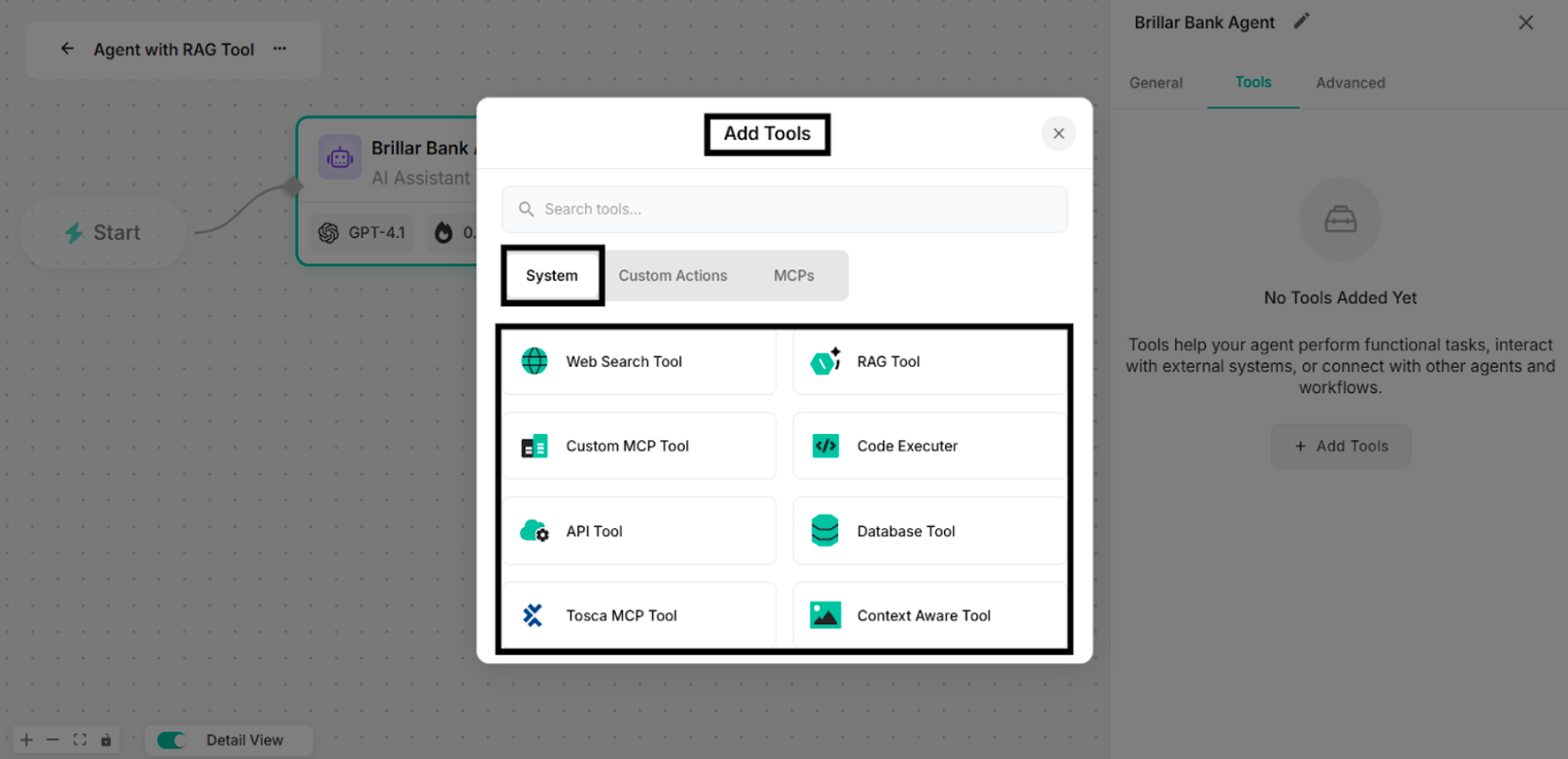 Figure: Available Tools in System of Add Tools Pop-up Box
4.2.2. Custom Actions
The system consists of three types of custom actions:
- URL Link – Redirects users to an external or internal URL when triggered.
- Contact Form – Collects user contact information through a predefined form.
- Custom Form – Captures structured, user-defined data based on configurable form fields.
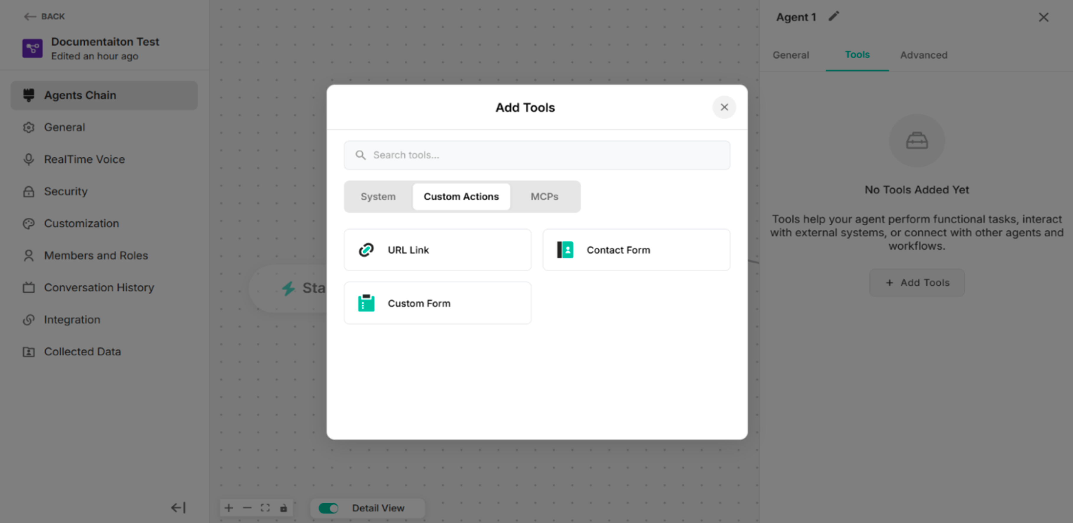 Figure: Custom Actions in Agent Chain Interface
4.2.2.1 URL Link
| Fields/Button | Description |
|---|---|
| Usage Description (Optional) | To add a short description explaining when and why this custom action should be used. |
| Instruction Prompt | To define the instruction or guidance associated with this custom action. |
| Button Label | To add the label of the button to display on the action button in the user interface. |
| Redirect URL Address | To add the desired URL Link |
| Complete Button | To complete the URL Link setup process |
| Delete Icon | To delete the URL Link custom action |
| Edit Icon | To edit the custom action name |
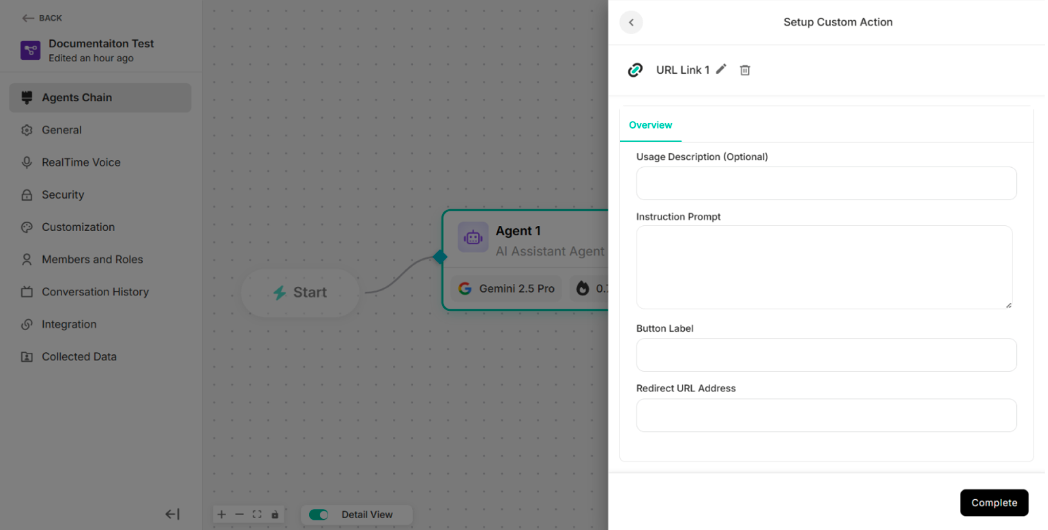 Figure: URL Link Setup Custom Action Interface in Agent Chain
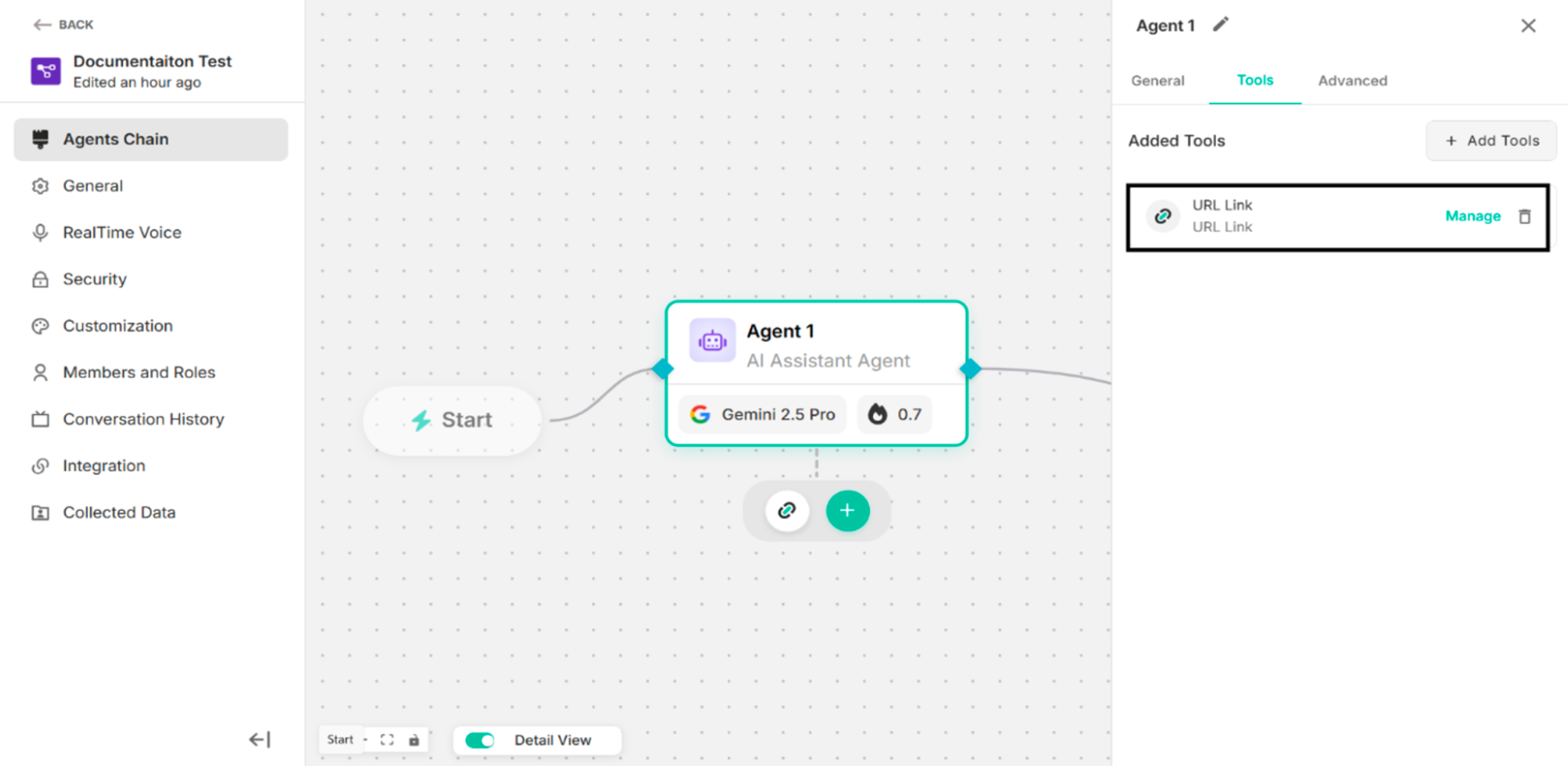 Figure: URL Link custom action is configured
| Options | Description |
|---|---|
| Manage | To manage the configured URL Link custom action |
| Delete Icon | To delete the configured URL Link custom action |
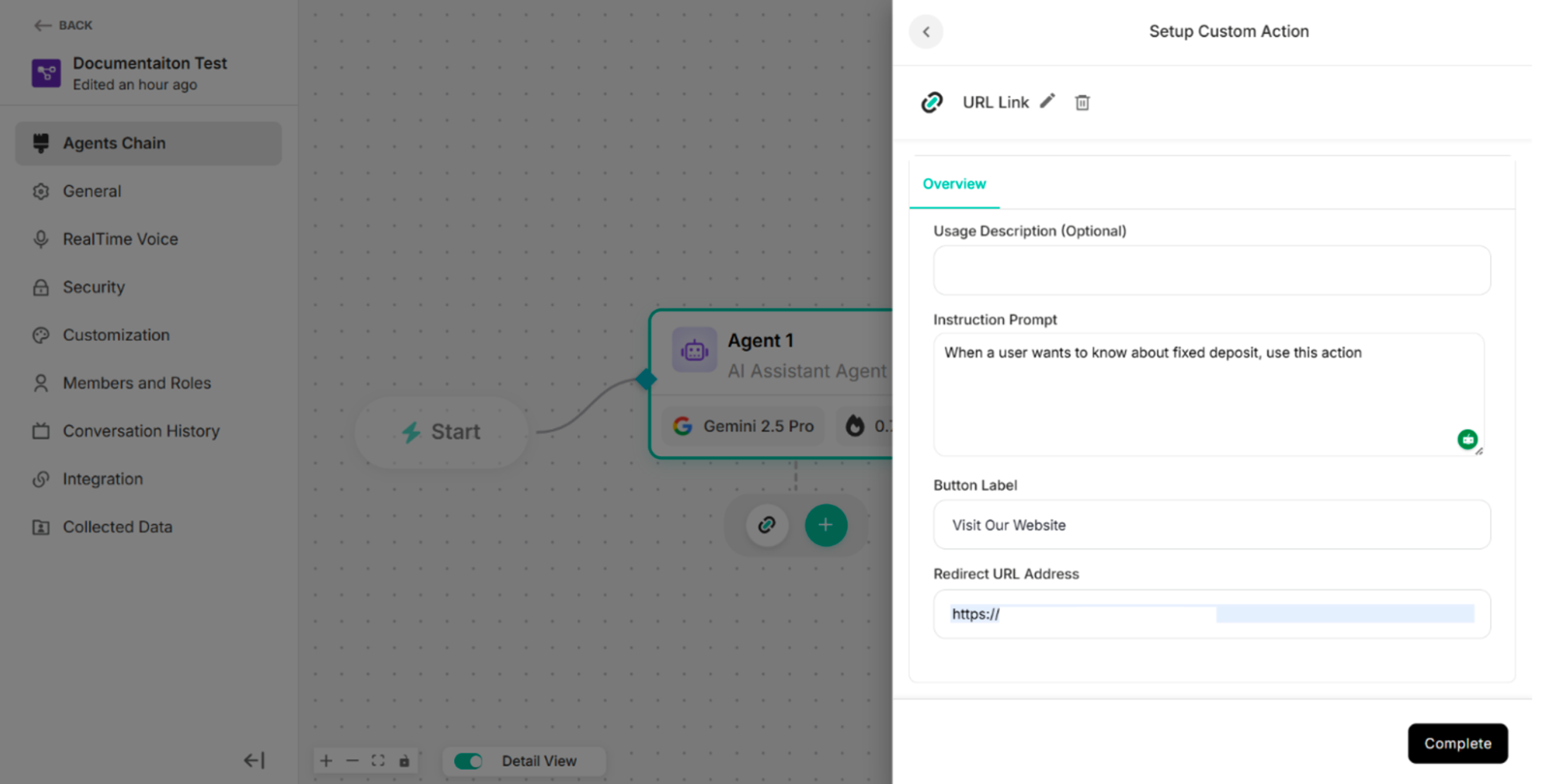 Figure: The Screen after clicking Manage Button
 Figure: The Screen after clicking the delete icon
4.2.2.2 Contact Form
| Sections | Description |
|---|---|
| Overview | To provide general information about the custom form action. |
| Form Fields | To use the predefined input fields that will be displayed to users. |
| API Request | To configure the API call that will be triggered when the form is submitted. |
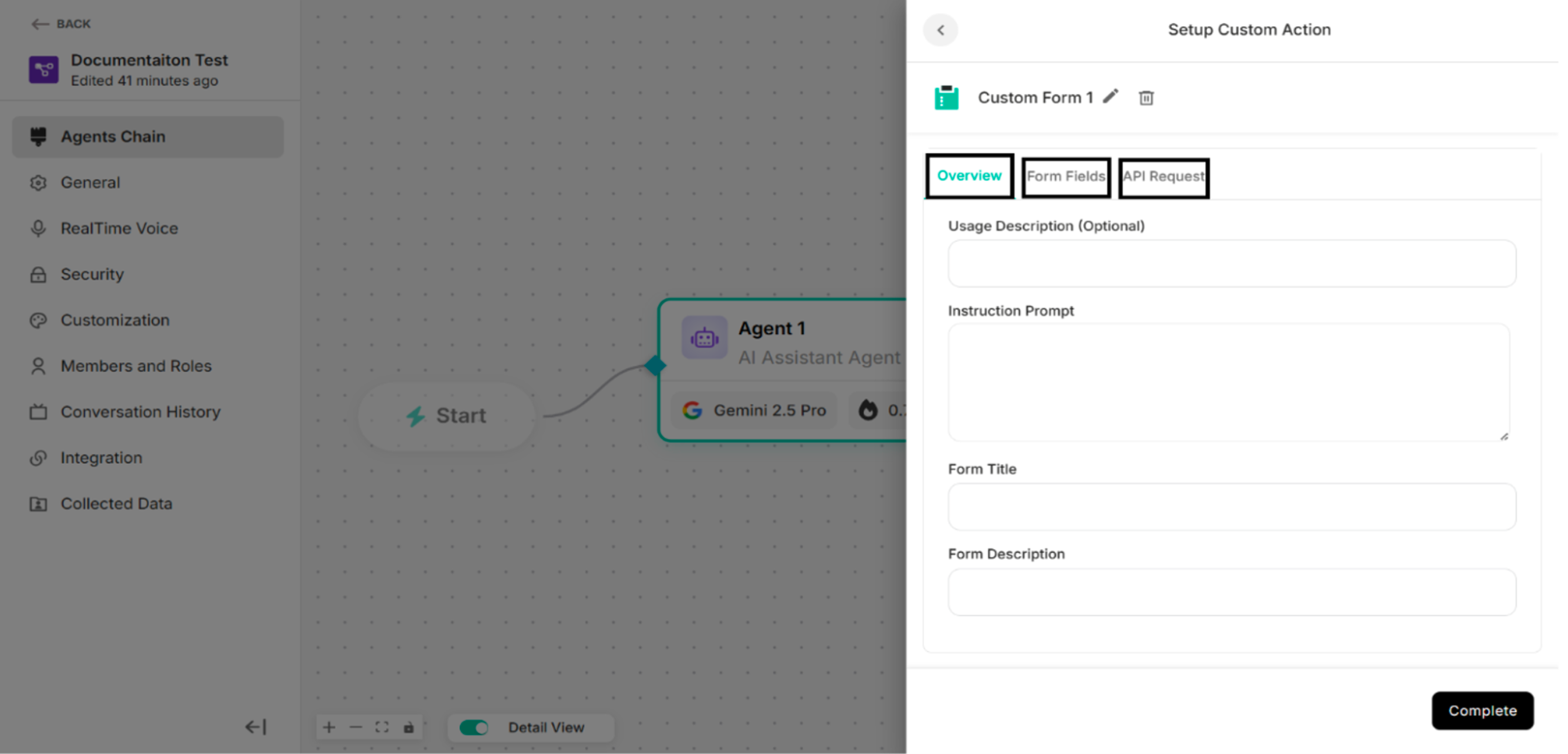 Figure: Contact Form Interface
| Buttons | Description |
|---|---|
| Complete Button | To complete the Contact Form setup process |
| Delete Icon | To delete the Contact Form custom action |
| Edit Icon | To edit the custom action name |
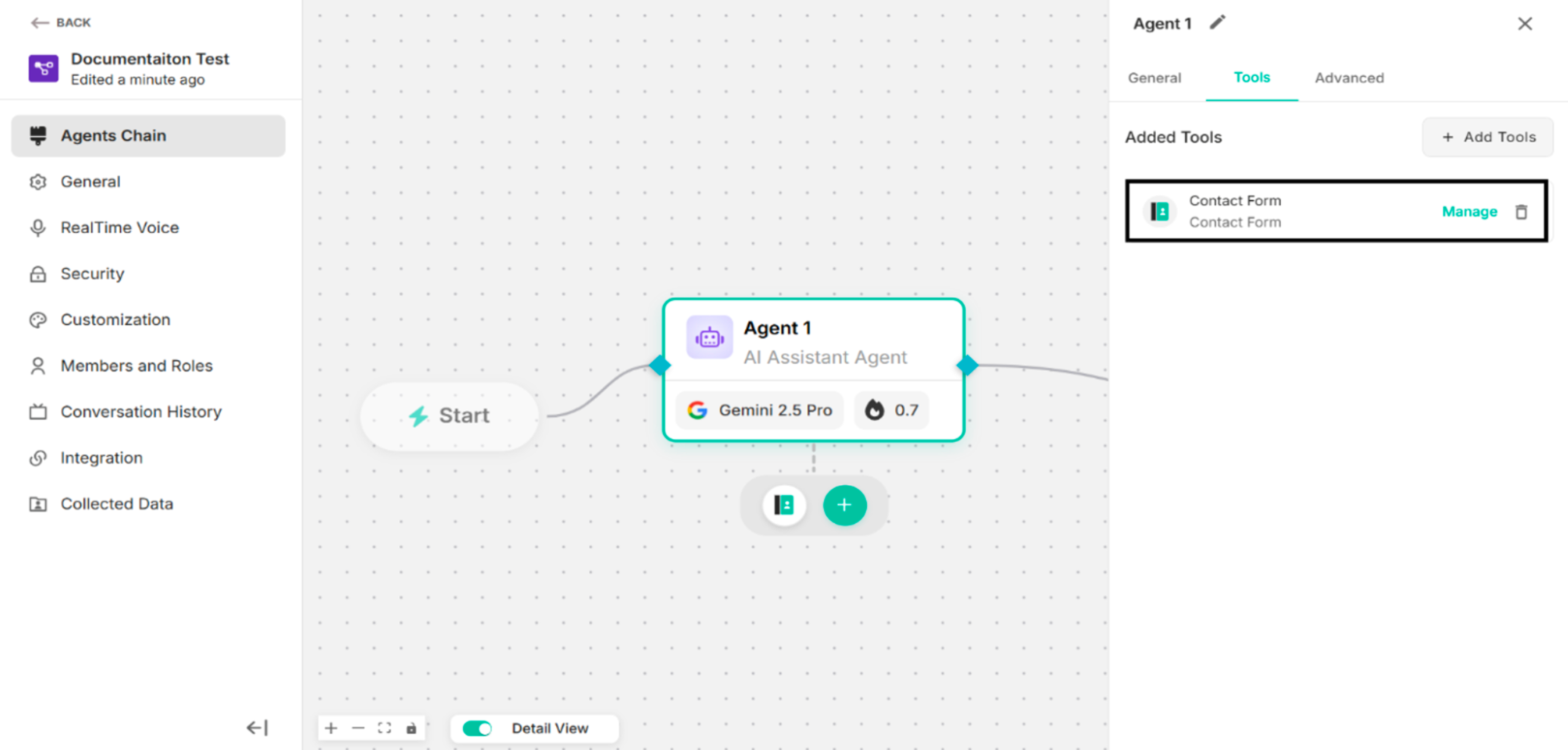 Figure: Contact Form is configured
| Options | Description |
|---|---|
| Manage | To manage the configured contact form custom action |
| Delete Icon | To delete the configured contact form custom action |
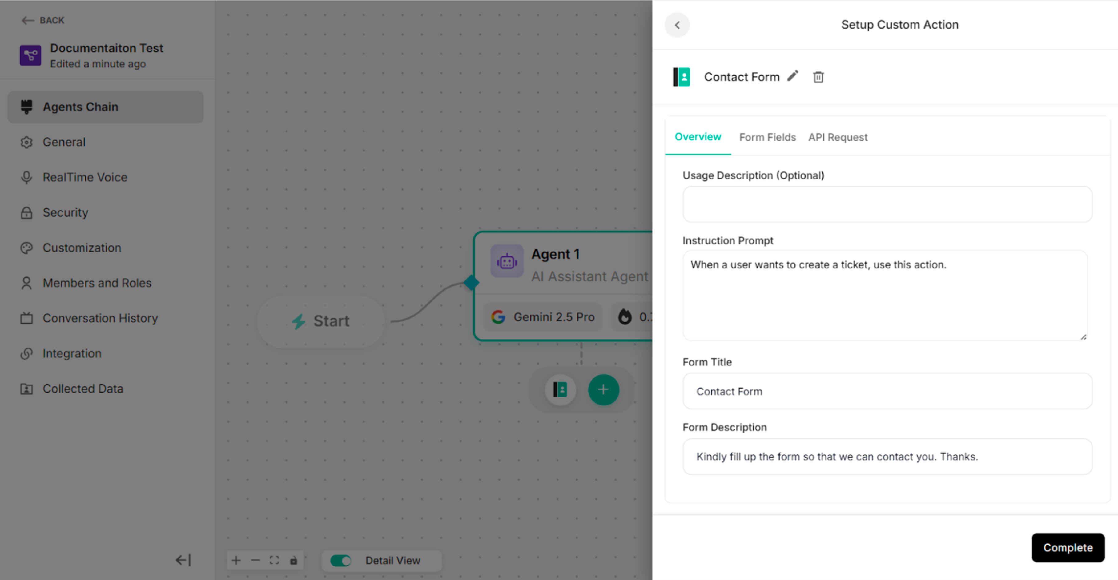 Figure: The Screen after clicking Manage Button
 Figure: The Screen after clicking delete icon
Overview of the Contact Form
| Fields | Description |
|---|---|
| Usage Description (Optional) | To add a short description explaining when and why this custom action should be used. |
| Instruction Prompt | To define the instruction or guidance associated with this custom action. |
| Form Title | To enter the title of the contact form |
| Form Description | To add the description of the contact form |
| Submit Message | To add the submit message of the contact form |
| Button Label | To add the label of the button to display on the action button in the user interface. |
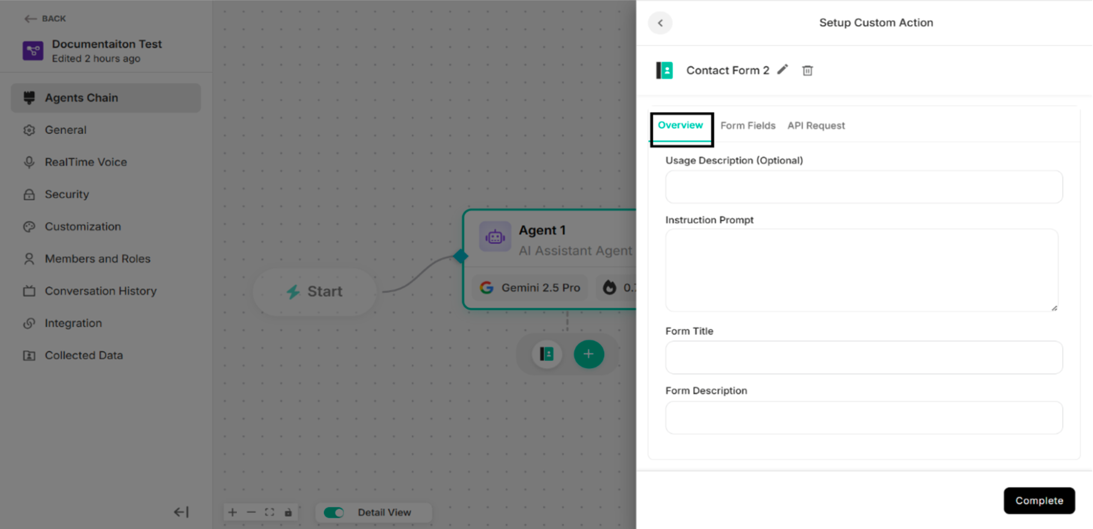 Figure: Overview Section
Form Fields of the Contact Form
The contact form includes four predefined fields:
- Name
- Phone
- Description
-63d357e0fb6b0cd9ff5480a21b840aa5.png) Figure: Form Fields Section (Default)
Figure: Form Fields Section (Default)
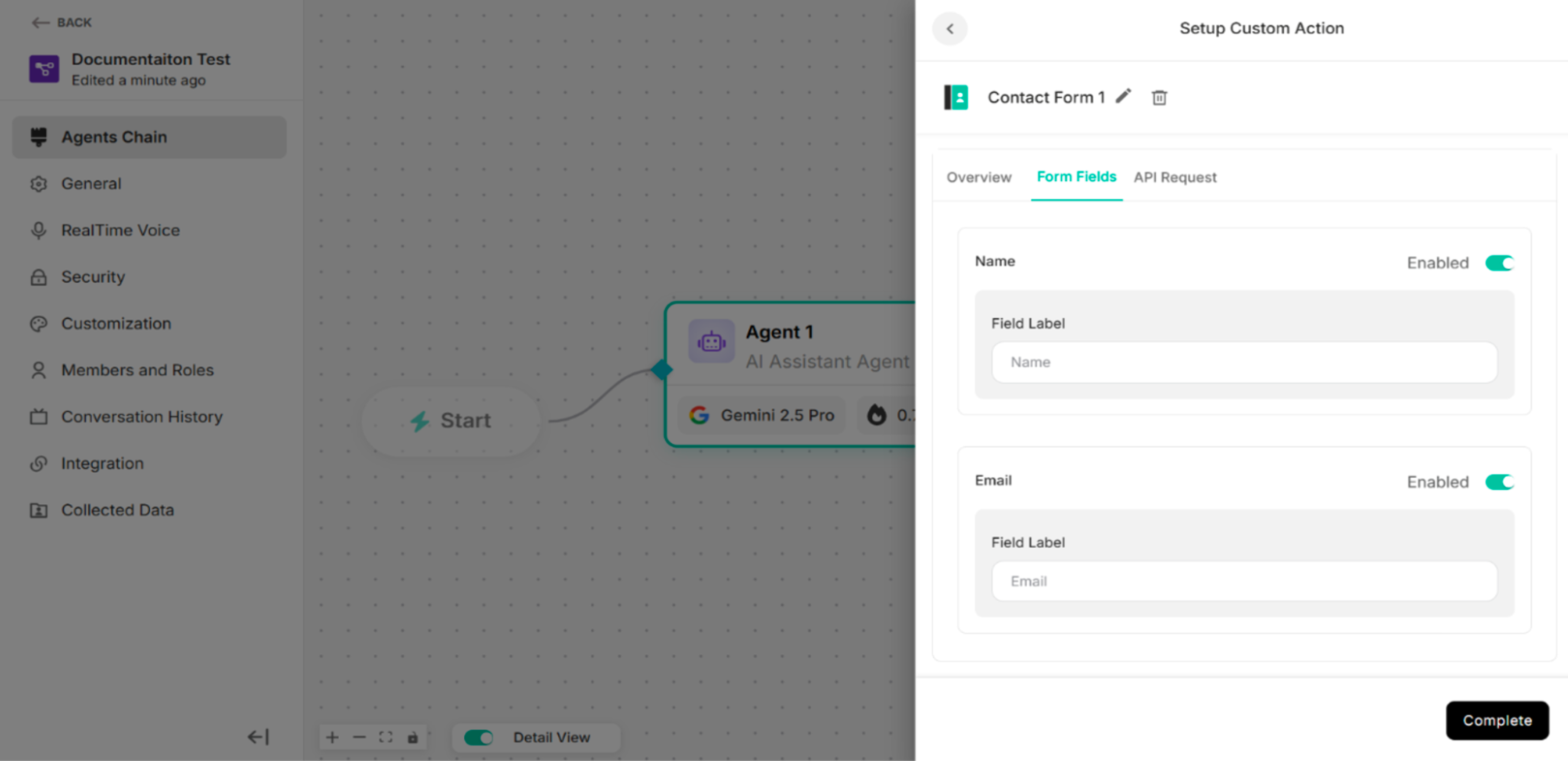 Figure: Form Fields Section with Enabled Fields
| Options | Description |
|---|---|
| Enabled | To enable the contact form fields |
| Disabled | To disable the contact form fields |
API Request of the Contact Form
The API Request defines how form data is sent to an external system when the contact form is submitted.
| Methods/Components | Description |
|---|---|
| GET | To retrieve data from the external system or server |
| POST | To send data to the external system or server |
| Parameter | To filter, search, or pass simple data to the external system or server |
| Header | To provide additional information required by the external system or server to correctly process the request |
| Body | To send structured data, such as form submissions or JSON objects |
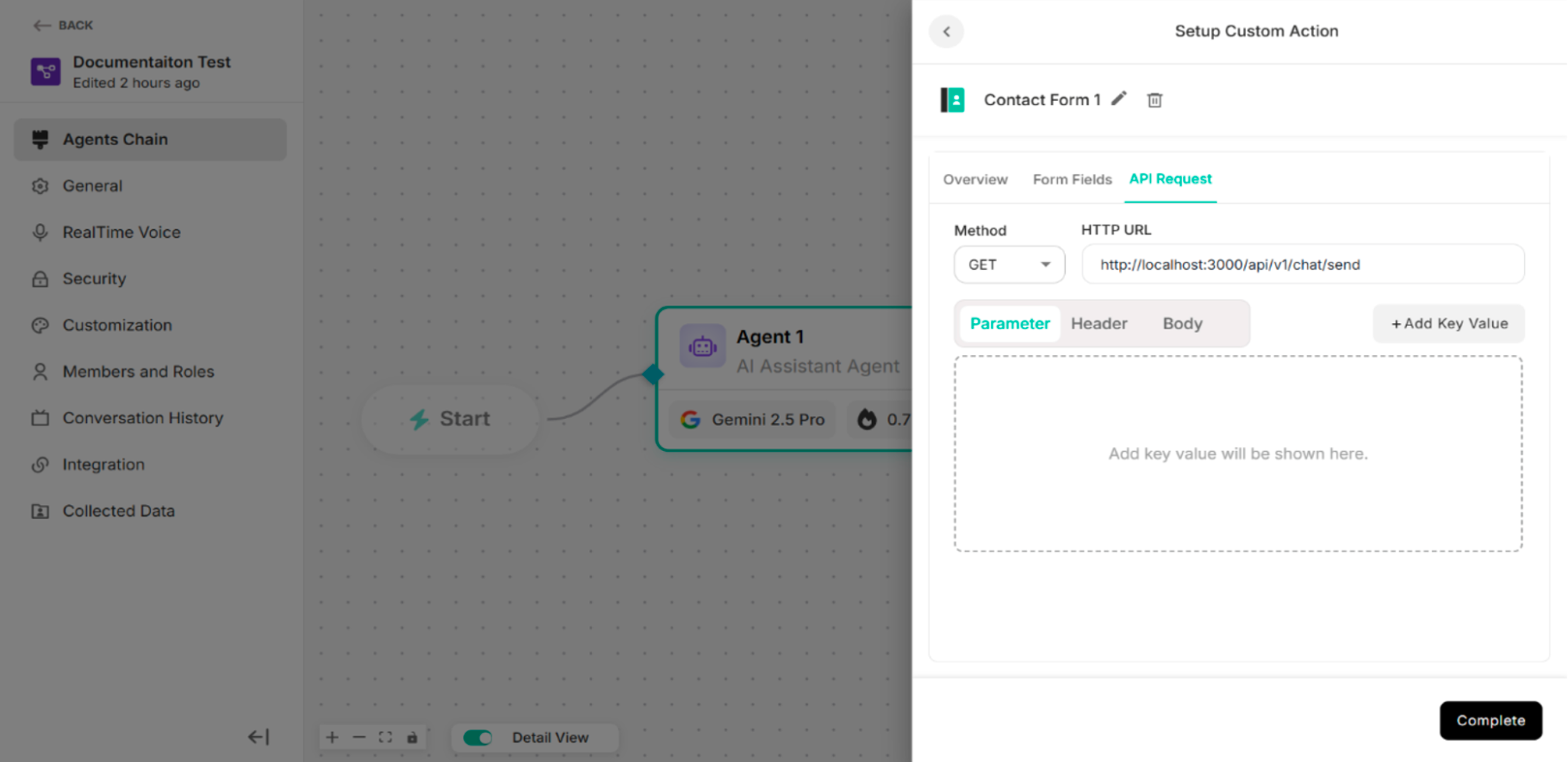 Figure: API Request Section
4.2.2.3 Custom Form
| Sections | Description |
|---|---|
| Overview | To provide general information about the custom form action. |
| Form Fields | To add the custom input fields that will be displayed to users. |
| API Request | To configure the API call that will be triggered when the form is submitted. |
Figure: Custom Form Interface
| Buttons | Description |
|---|---|
| Complete Button | To complete the Custom Form setup process |
| Delete Icon | To delete the Custom Form custom action |
| Edit Icon | To edit the custom action name |
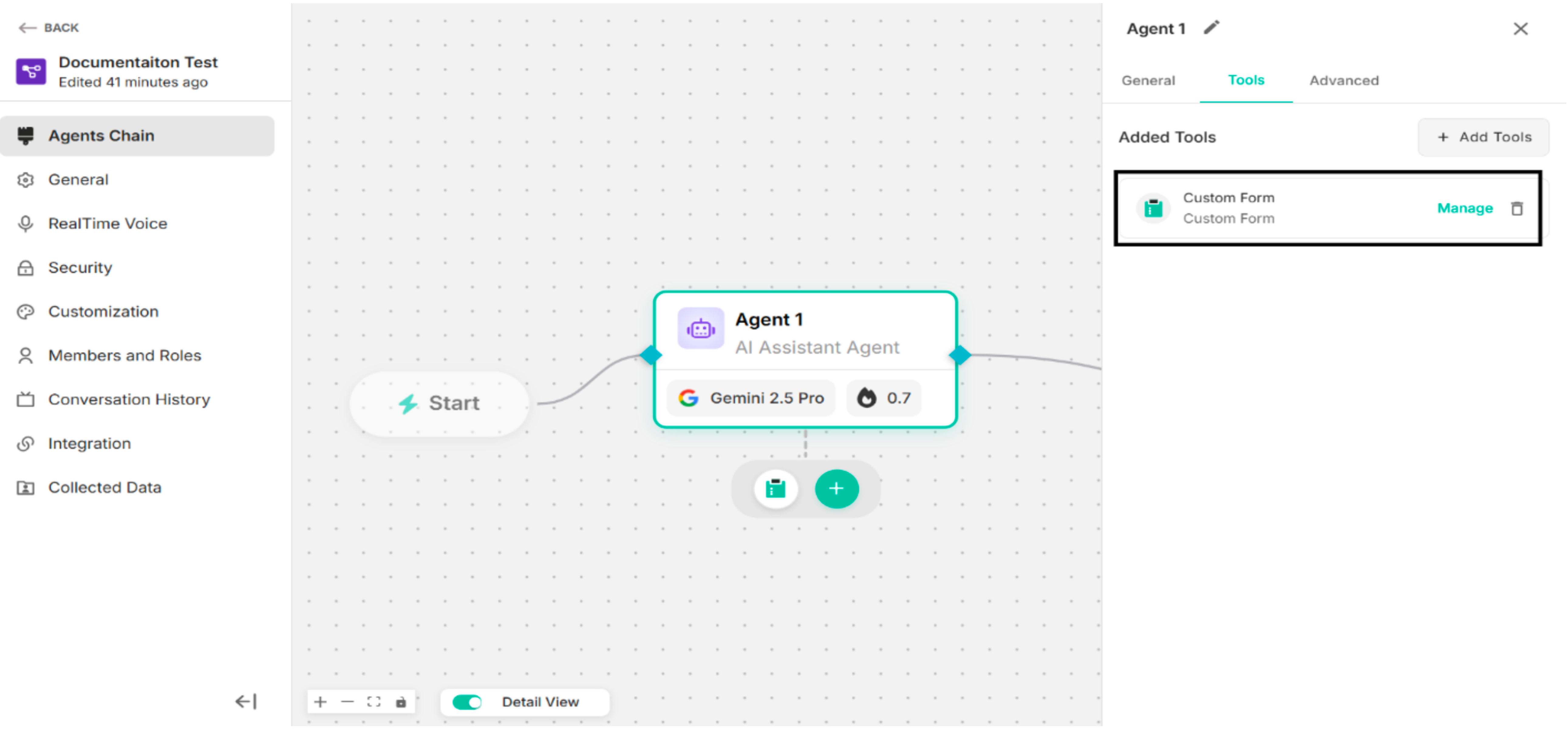 Figure: Custom Form is configured
| Options | Description |
|---|---|
| Manage | To manage the configured custom form |
| Delete Icon | To delete the configured custom form |
Figure: The Screen after clicking Manage Button
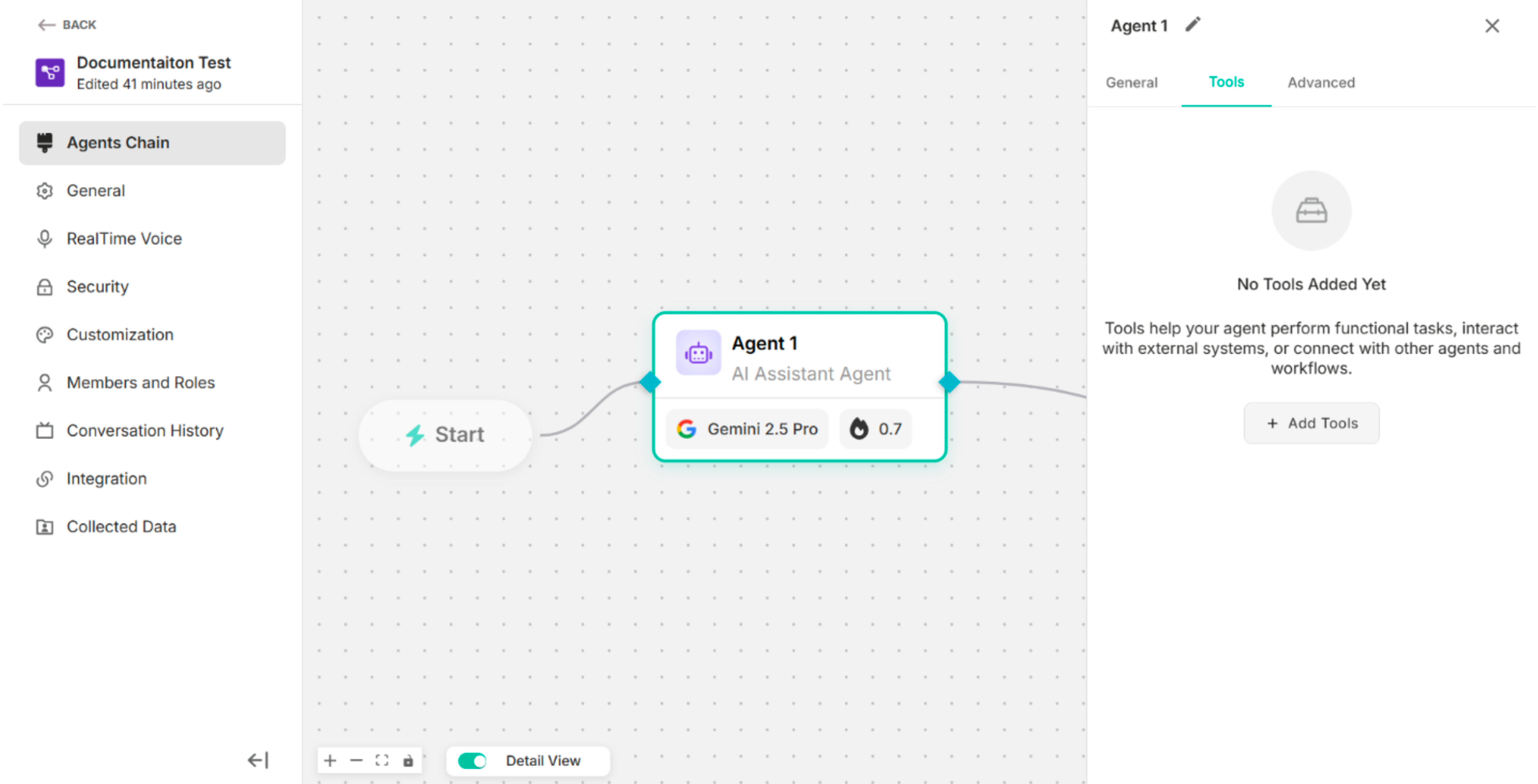 Figure: The Screen after clicking delete icon2
Overview of the Custom Form
| Fields | Description |
|---|---|
| Usage Description (Optional) | To add a short description explaining when and why this custom action should be used. |
| Instruction Prompt | To define the instruction or guidance associated with this custom action. |
| Form Title | To enter the title of the custom form |
| Form Description | To add the description of the custom form |
| Submit Message | To add the submit message of the custom form |
| Button Label | To add the label of the button to display on the action button in the user interface. |
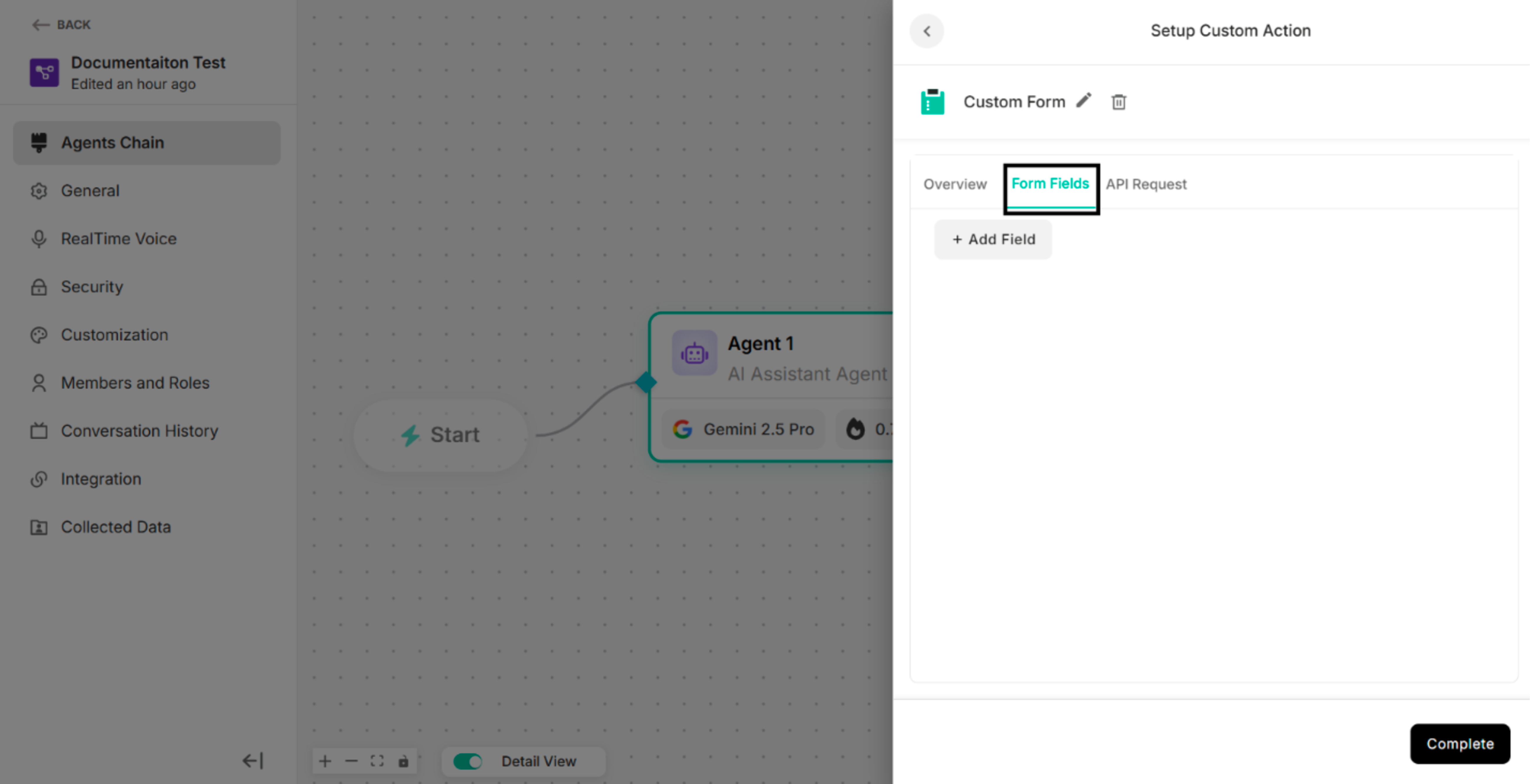 Figure: Overview Section2
Form Fields of the Custom Form
| Button | Description |
|---|---|
| + Add Field | To add the custom form fields |
Figure: Form Fields Section under Custom Form
Step1: Click +Add Field in the Form Fields of Custom Action The system will display the added form field.
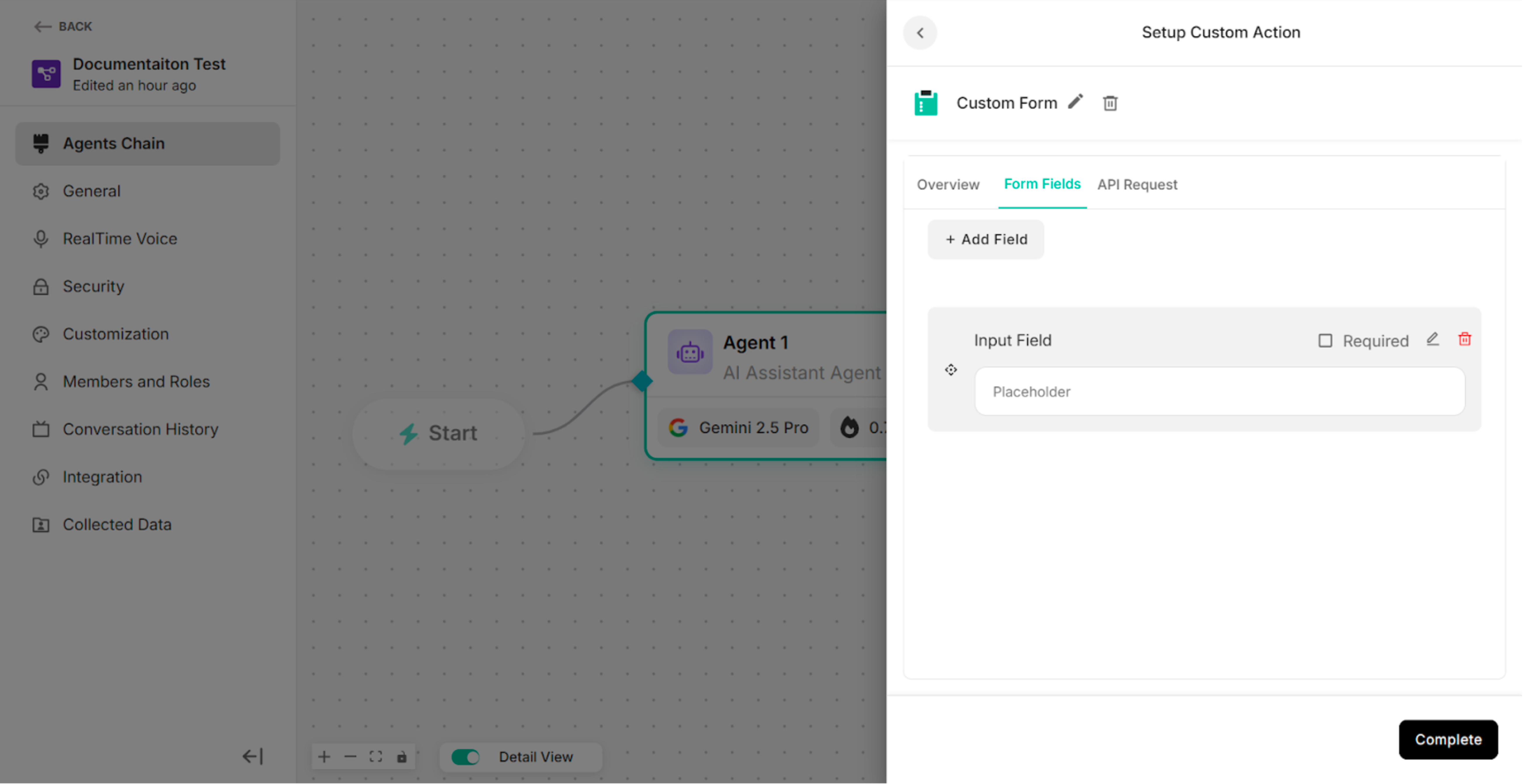 Figure: The Form Fields Section after clicking "+Add Field" Button
| Icons | Description |
|---|---|
| Check Box Icon for Required | To defines whether the field is mandatory or optional |
| Edit Icon | To edit form fields |
| Delete Icon | To delete the added form fields |
Step2: Click Edit Icon on the added form field The system will show the Edit Form Field pop-up.
-60042a91a38ba2a3d039ef2f67f6faaa.png) Figure: Edit Form Field with Text Field Type (default)
Figure: Edit Form Field with Text Field Type (default)
| No | Field Type |
|---|---|
| 1. | Text |
| 2. | |
| 3. | Phone |
| 4. | Number |
| 5. | Text Area |
| 6. | Dropdown |
| 7. | Checkbox |
| Buttons | Description |
|---|---|
| Save | To save the update or edit information in the edit form field |
| Cancel | To cancel the form field editing process |
For Text Field Type:
| Fields | Description |
|---|---|
| Field Type | To select the type of input field (e.g., Text, Number, Email) that determines how data is entered and validated. |
| Label | To define the display name of the form field shown to end users. |
| Placeholder | To specify the hint text displayed inside the field to guide users on what to enter. |
| Default Value | To set a pre-filled value that appears in the field when the form is loaded. |
| Error Message | To define the error message. |
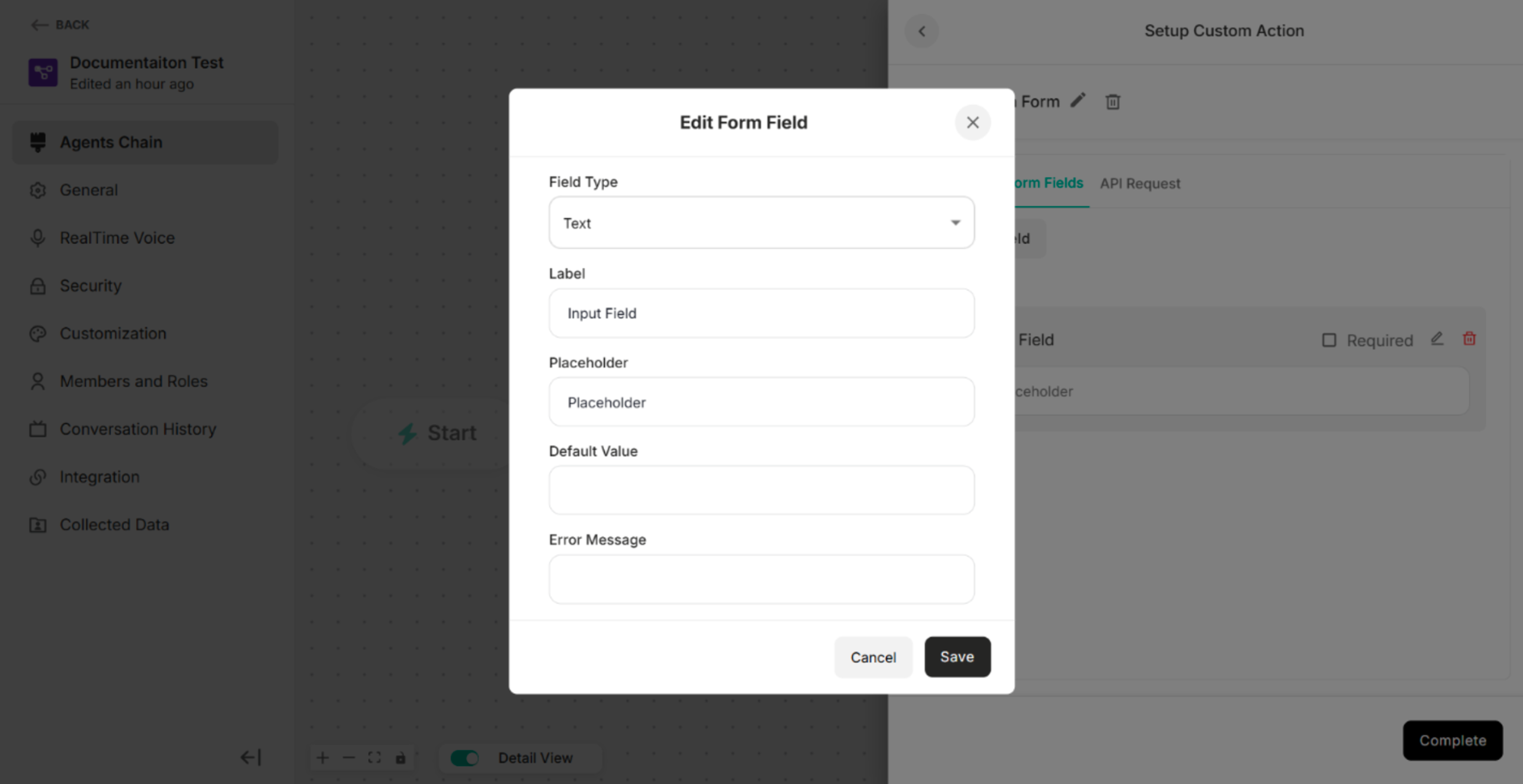 Figure: Edit Form Field for Text Field Type
For Email Field Type:
| Fields | Description |
|---|---|
| Field Type | To select the type of input field (e.g., Text, Number, Email) that determines how data is entered and validated. |
| Label | To define the display name of the form field shown to end users. |
| Placeholder | To specify the hint text displayed inside the field to guide users on what to enter. |
| Default Value | To set a pre-filled value that appears in the field when the form is loaded. |
| Error Message | To define the error message. |
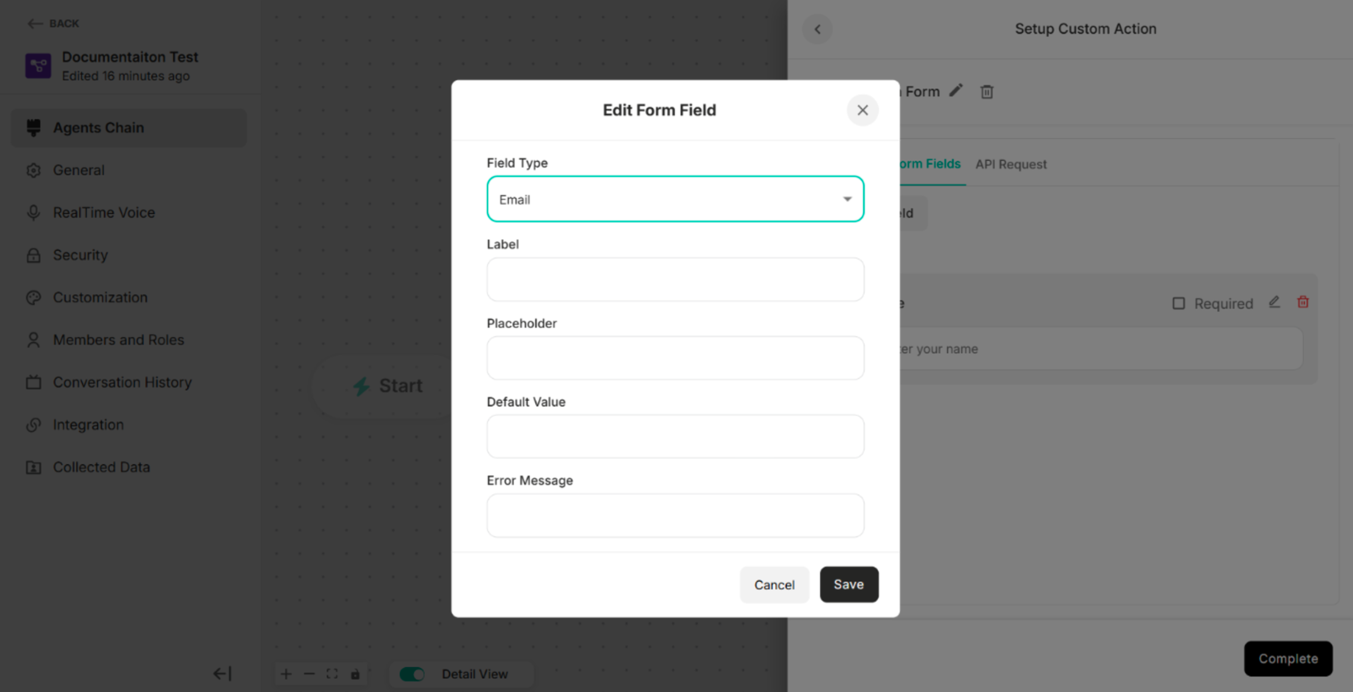 Figure: Edit Form Field for Email Field Type
For Phone Field Type:
| Fields | Description |
|---|---|
| Field Type | To select the type of input field (e.g., Text, Number, Email) that determines how data is entered and validated. |
| Label | To define the display name of the form field shown to end users. |
| Placeholder | To specify the hint text displayed inside the field to guide users on what to enter. |
| Default Value | To set a pre-filled value that appears in the field when the form is loaded. |
| Error Message | To define the error message. |
 Figure: Edit Form Field for Phone Field Type
For Number Field Type:
| Fields | Description |
|---|---|
| Field Type | To select the type of input field (e.g., Text, Number, Email) that determines how data is entered and validated. |
| Label | To define the display name of the form field shown to end users. |
| Placeholder | To specify the hint text displayed inside the field to guide users on what to enter. |
| Default Value | To set a pre-filled value that appears in the field when the form is loaded. |
| Error Message | To define the error message. |
 Figure: Edit Form Field for Number Field Type
For Text Area Field Type:
| Fields | Description |
|---|---|
| Field Type | To select the type of input field (e.g., Text, Number, Email) that determines how data is entered and validated. |
| Label | To define the display name of the form field shown to end users. |
| Placeholder | To specify the hint text displayed inside the field to guide users on what to enter. |
| Error Message | To define the error message. |
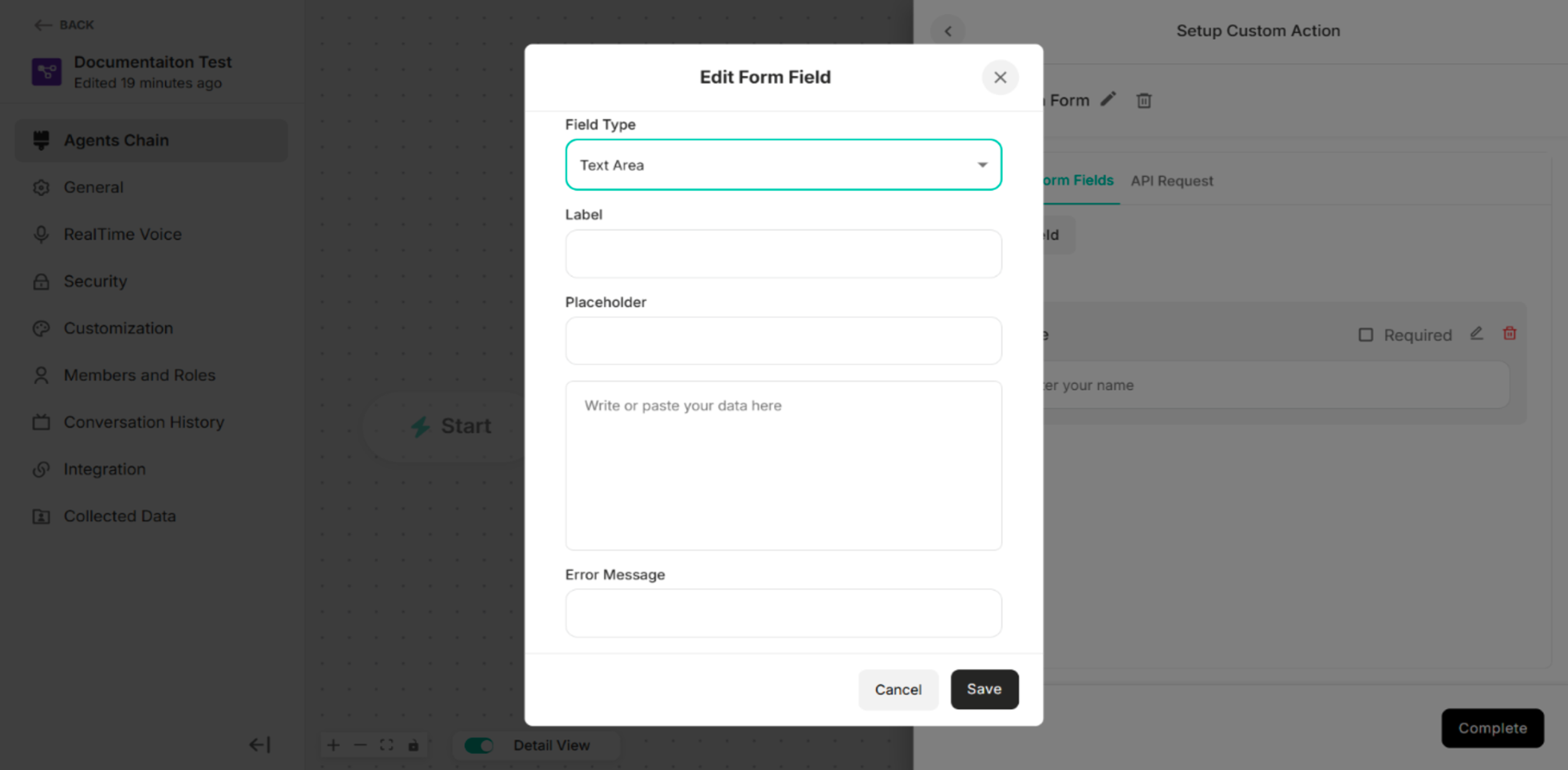 Figure: Edit Form Field for Text Area Field Type
For Dropdown Field Type:
| Fields/Button | Description |
|---|---|
| Field Type | To select the type of input field (e.g., Text, Number, Email) that determines how data is entered and validated. |
| Label | To define the display name of the form field shown to end users. |
| Option List | To select one option in the custom form |
| Error Message | To define the error message. |
| +Add Button | To add the option list |
| Delete Icon | To delete or remove the option list |
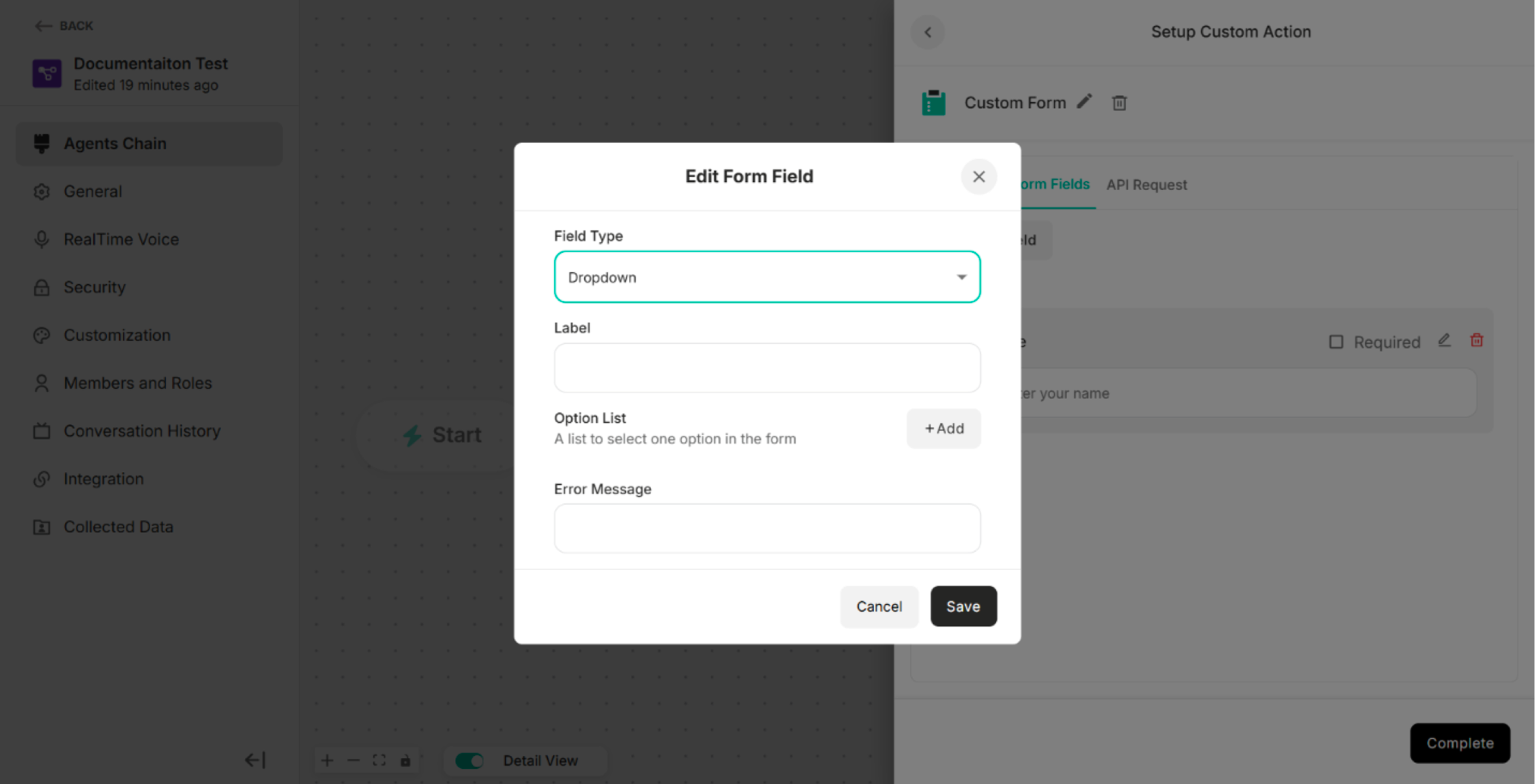 Figure: Edit Form Field for Dropdown Field Type
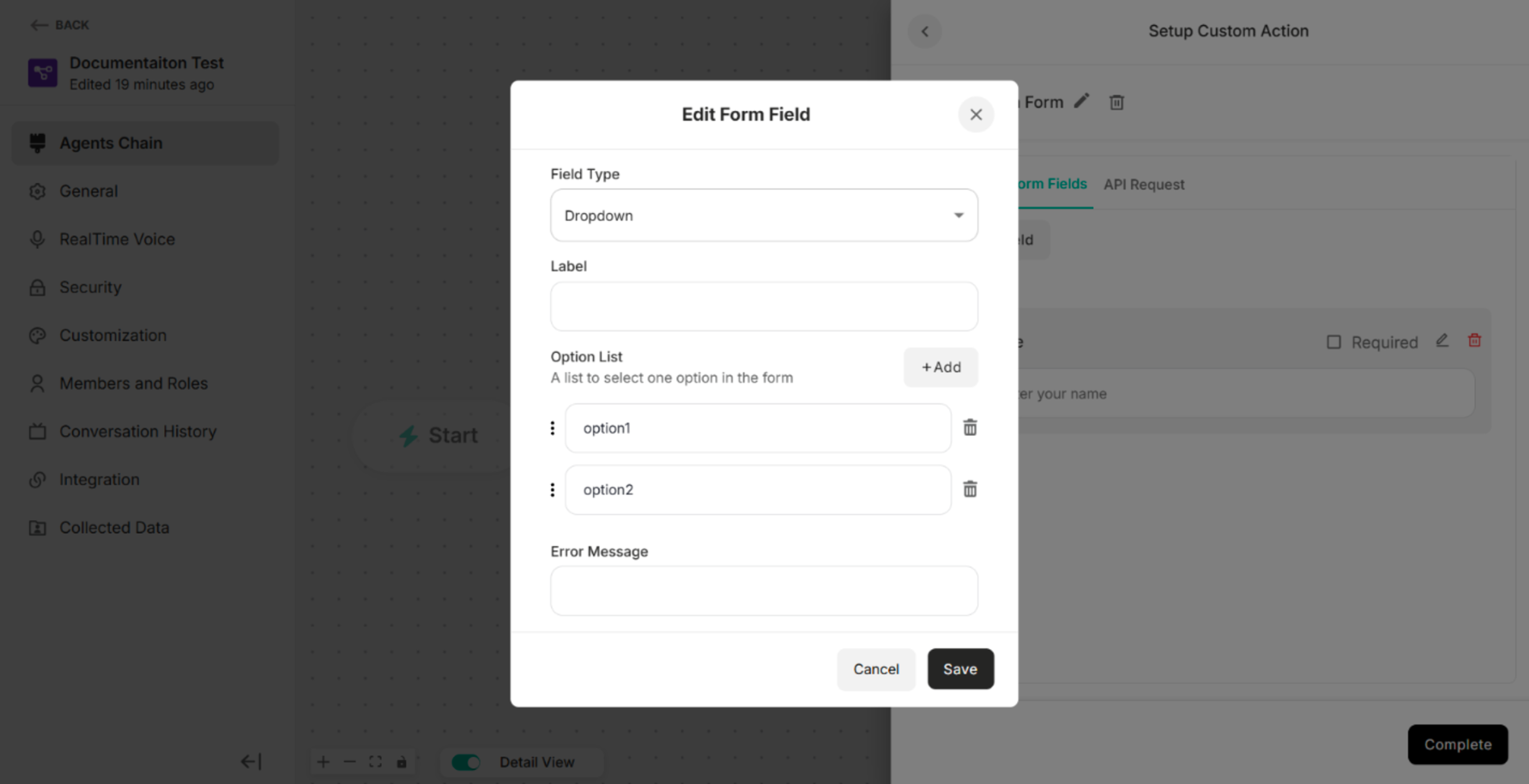 Figure: Edit Form Field for Dropdown Field Type after clicking "+Add" Button
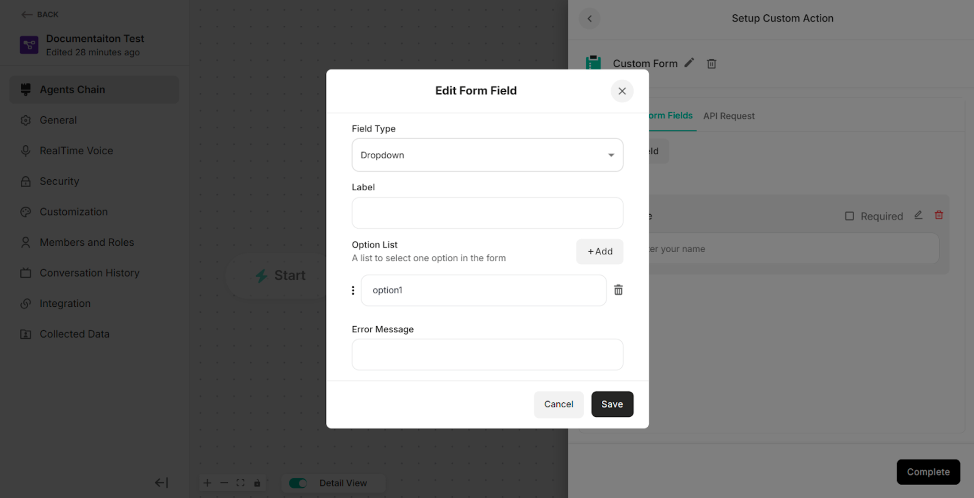 Figure: Edit Form Field for Dropdown Field Type after clicking the delete icon on option2
For Checkbox Field Type:
| Fields/Button | Description |
|---|---|
| Field Type | To select the type of input field (e.g., Text, Number, Email) that determines how data is entered and validated. |
| Label | To define the display name of the form field shown to end users. |
| Option List | To select one option in the custom form |
| Error Message | To define the error message. |
| +Add Button | To add the option list |
| Delete Icon | To delete or remove the option list |
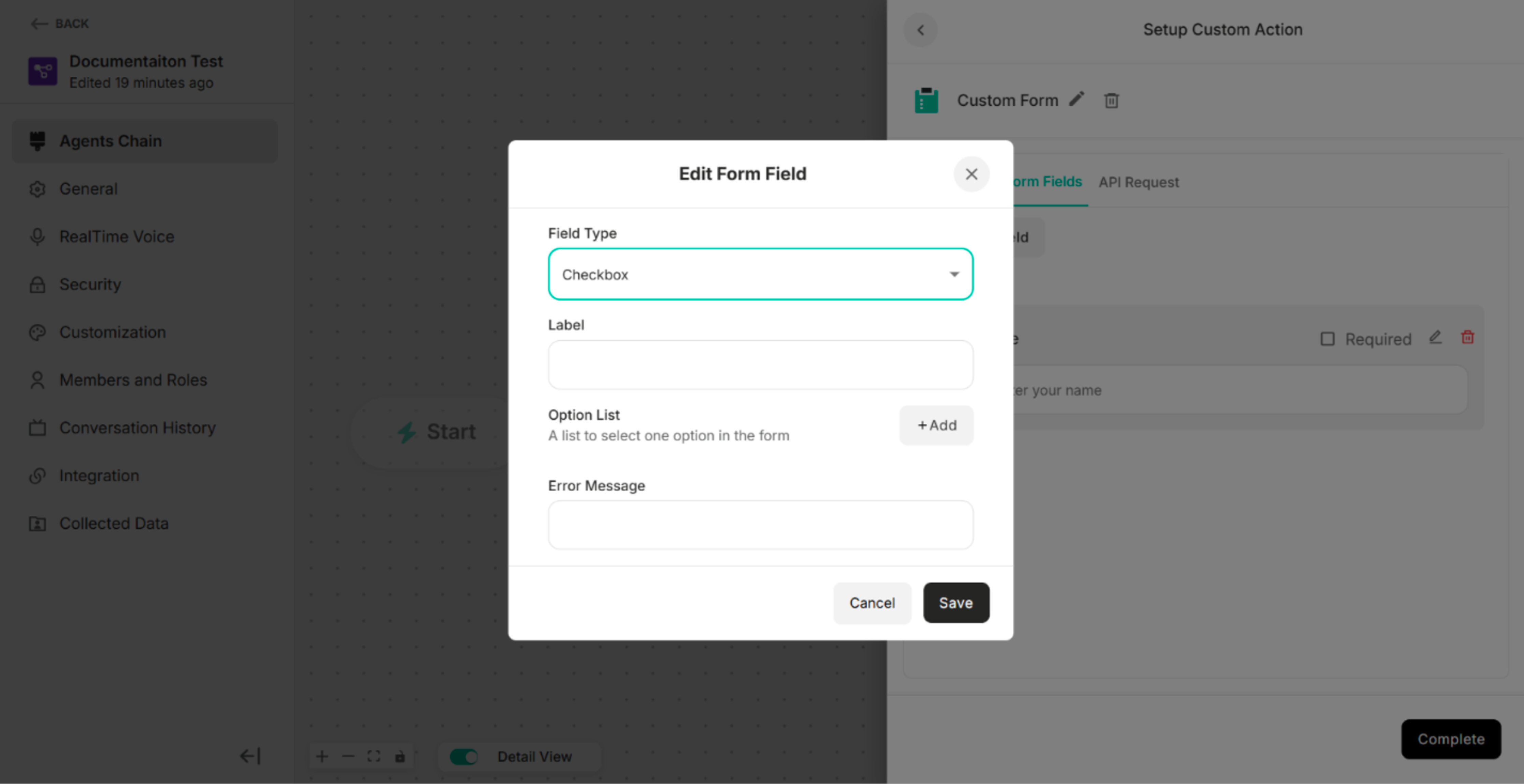 Figure: Edit Form Field for Checkbox Field Type
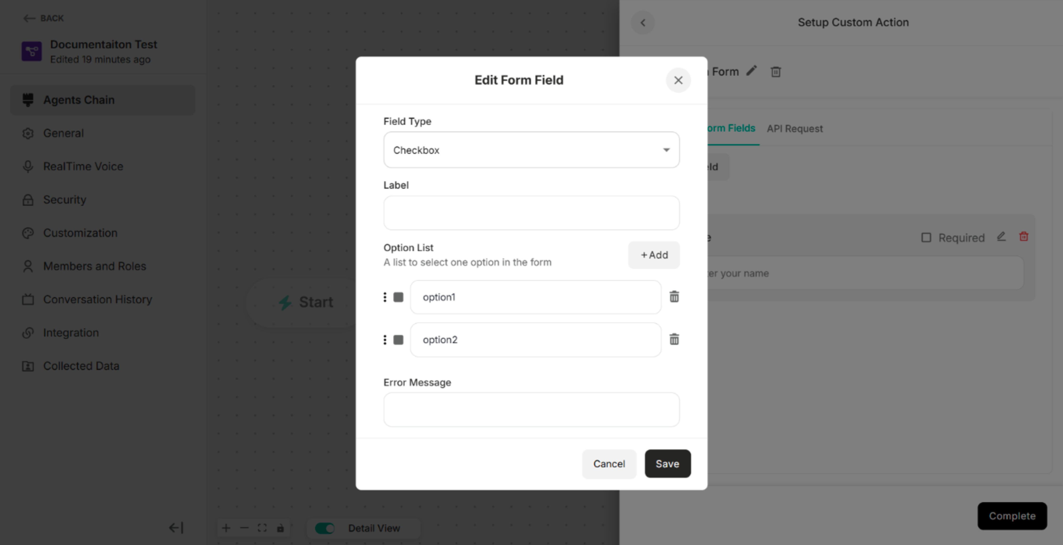 Figure: Edit Form Field for Checkbox Field Type after clicking "+Add" Button
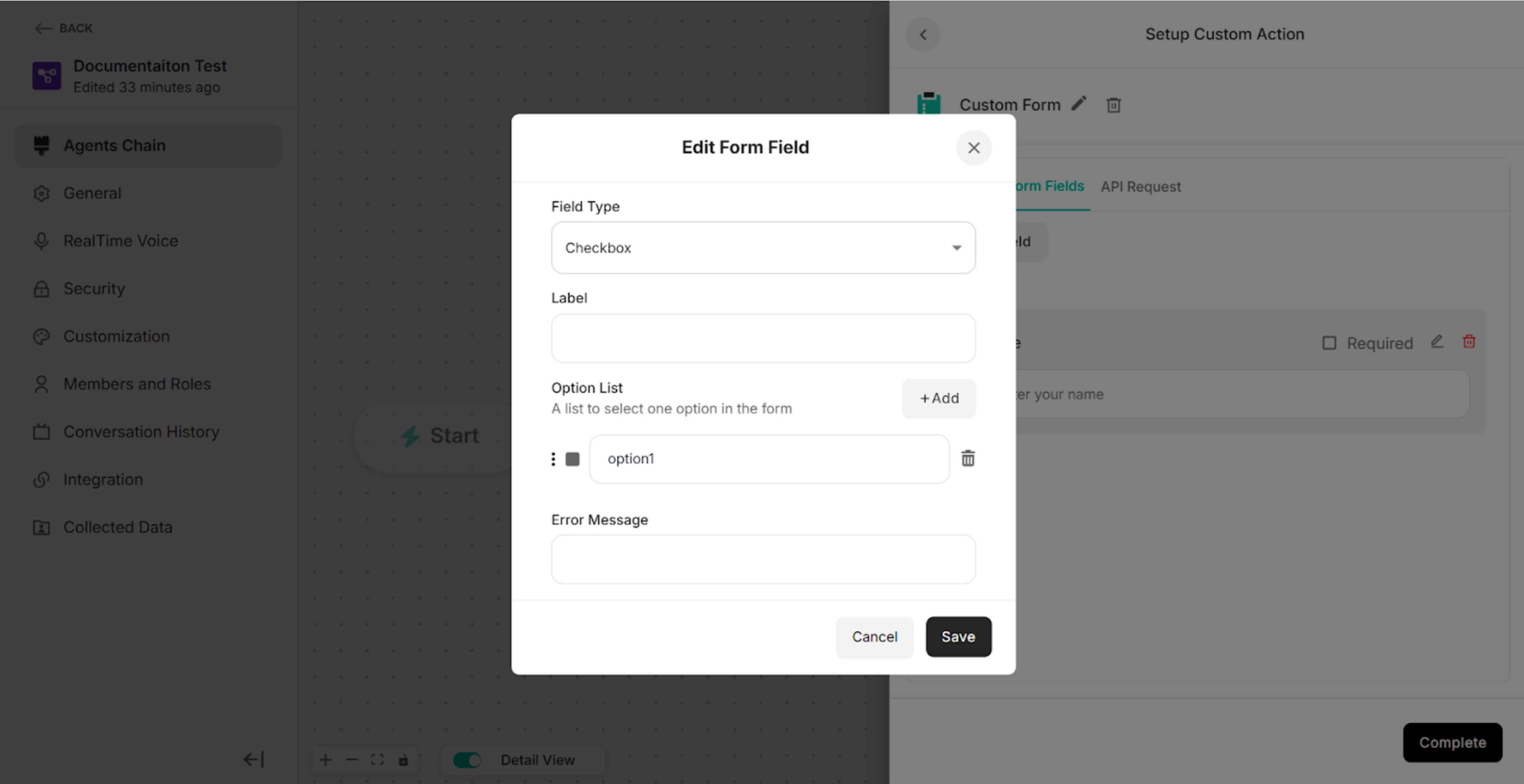 Figure: Edit Form Field for Checkbox Field Type after clicking the delete icon on option2
API Request of the Custom Form
The API Request defines how form data is sent to an external system when the custom form is submitted.
| Methods/Components | Description |
|---|---|
| GET | To retrieve data from the external system or server |
| POST | To send data to the external system or server |
| Parameter | To filter, search, or pass simple data to the external system or server |
| Header | To provide additional information required by the external system or server to correctly process the request |
| Body | To send structured data, such as form submissions or JSON objects |
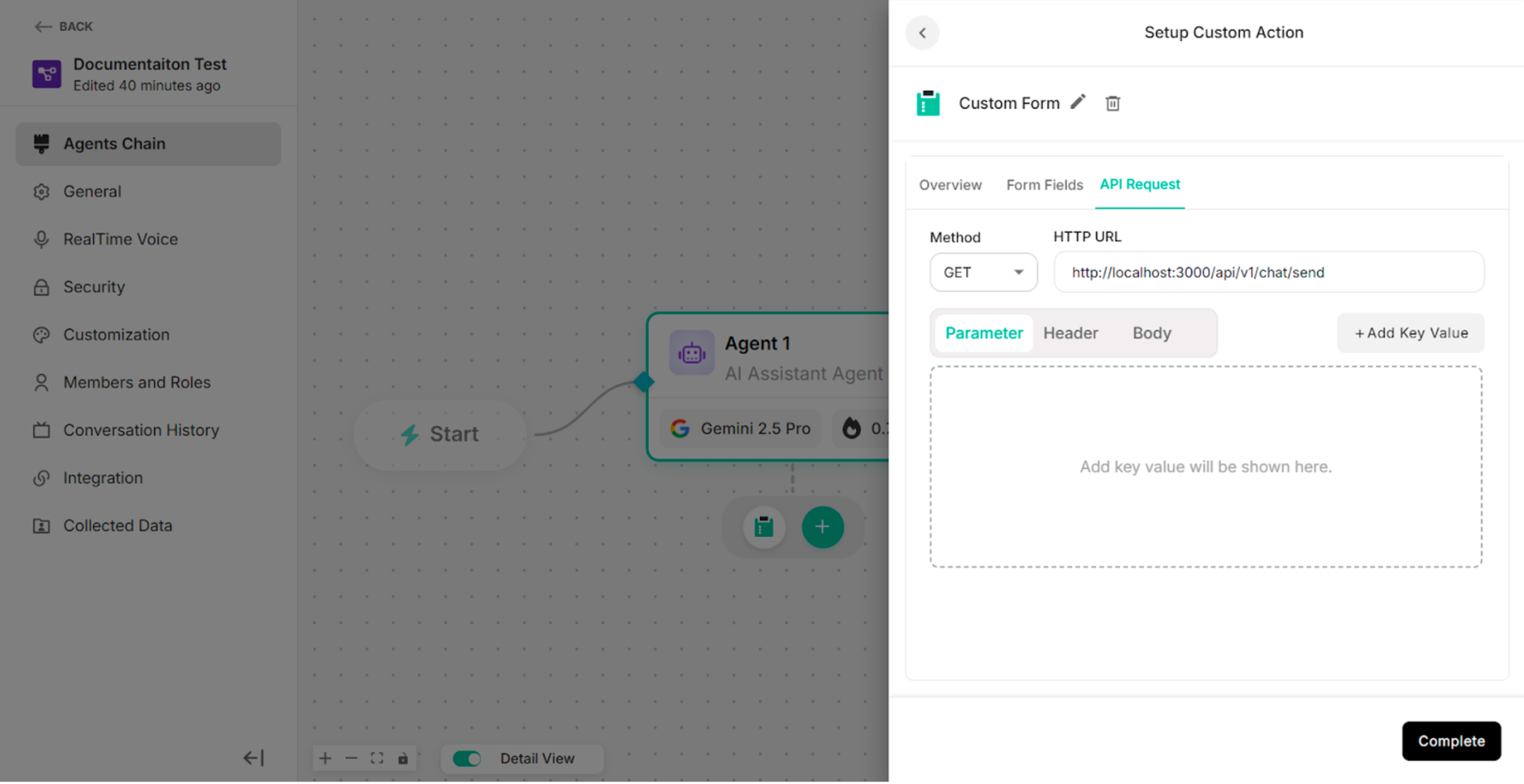 Figure: API Request Section2
4.2.3. MCPs
To create a custom MCP template, user can integrate MCP connectors under Settings platform. Choose one Custom MCP Template for the selected type of agent chain to create.
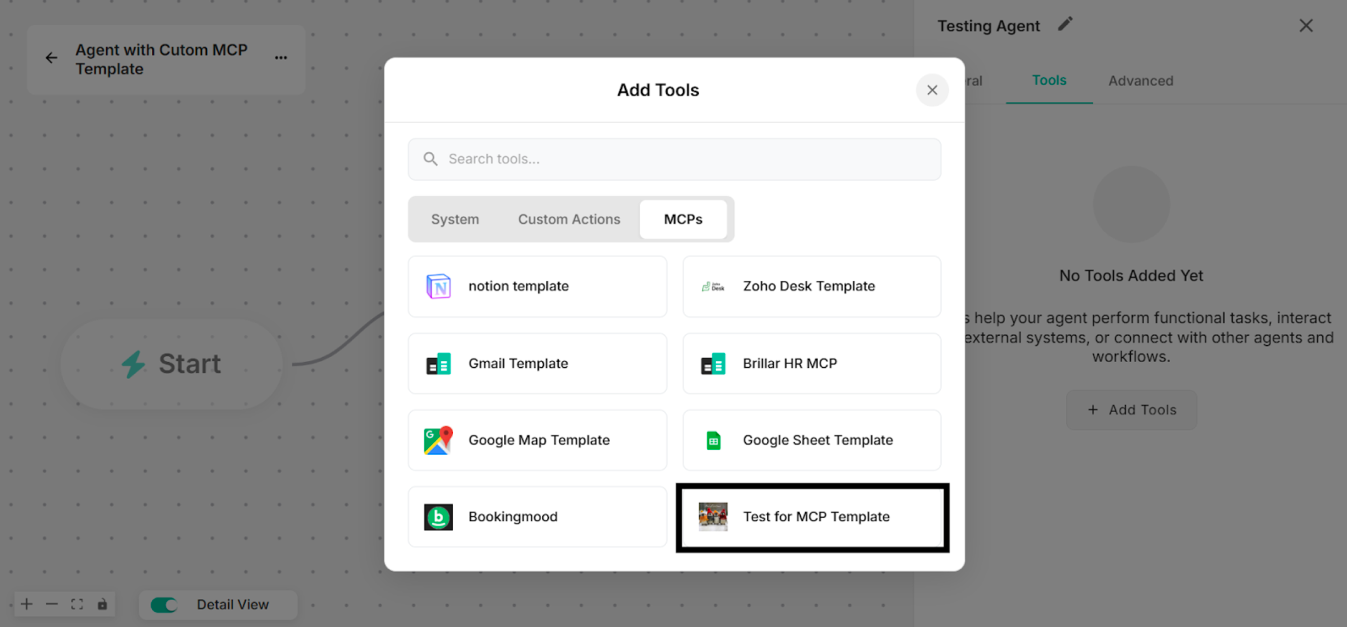 Figure: Showing to select the Created Custom MCP Template from Platform in Add Tools List
By clicking Manage button, rename the tool name for the Untitled Tool. Then, enter valid URL that has been gotten from the Composio Site.
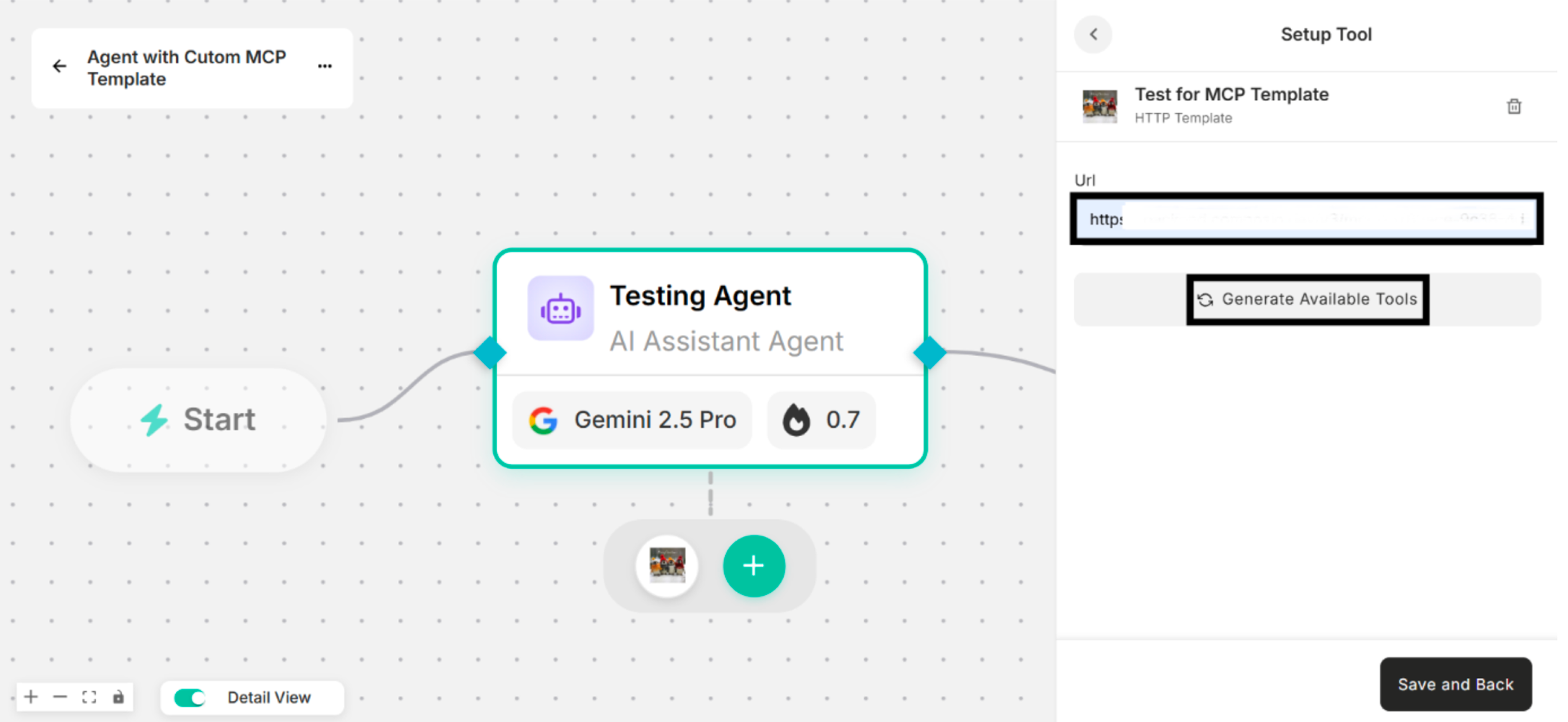 Figure: Showing URL Box under Setup Tool Interface
Click "Generate Available Tools" that are added to use the custom MCP template. Select the tools that the user wants to use among these available tools.
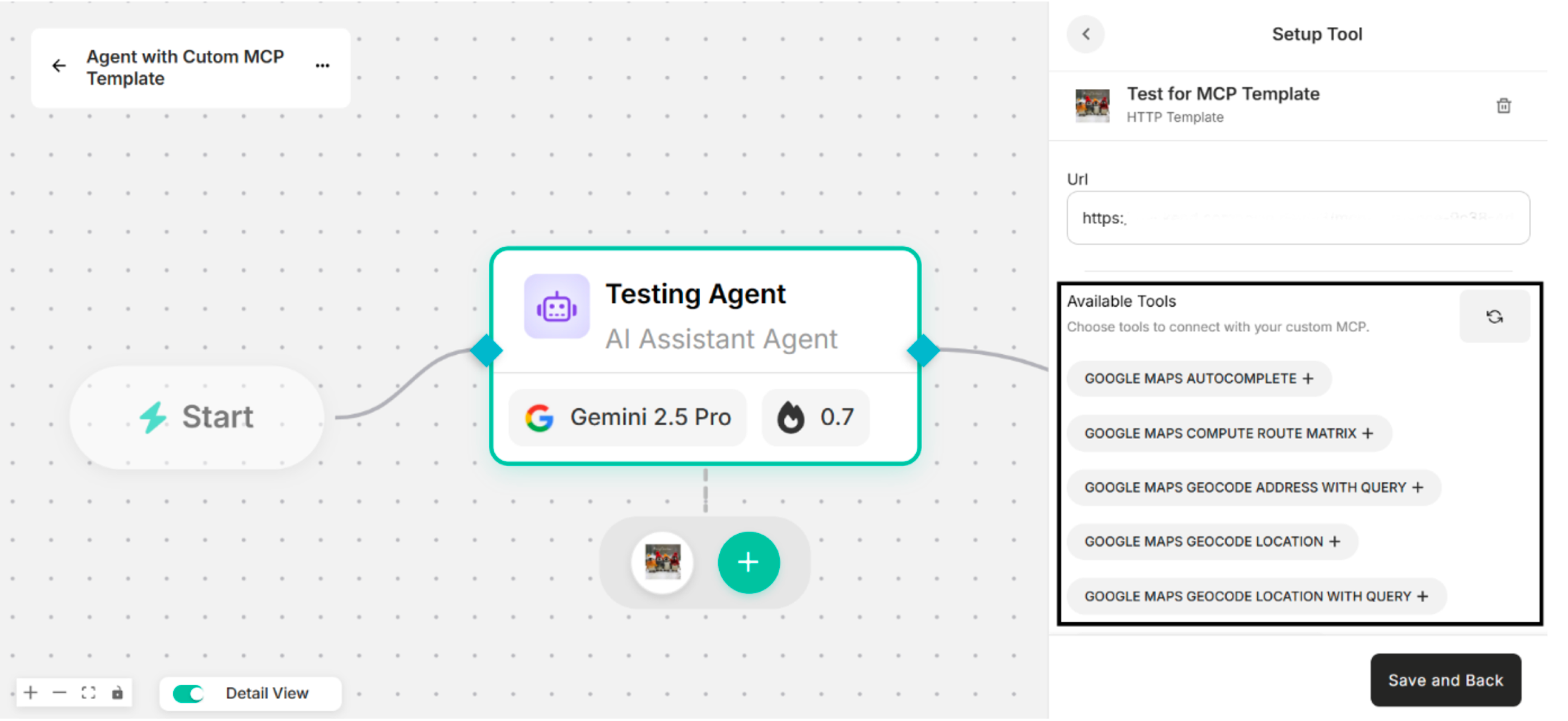 Figure: Showing the Available Tools to connect with the Custom MCP Template
| Buttons | Description |
|---|---|
| Manage | To choose Available Tools to connect with and edit the created custom MCP template. |
| Delete | To delete the created custom MCP template. |
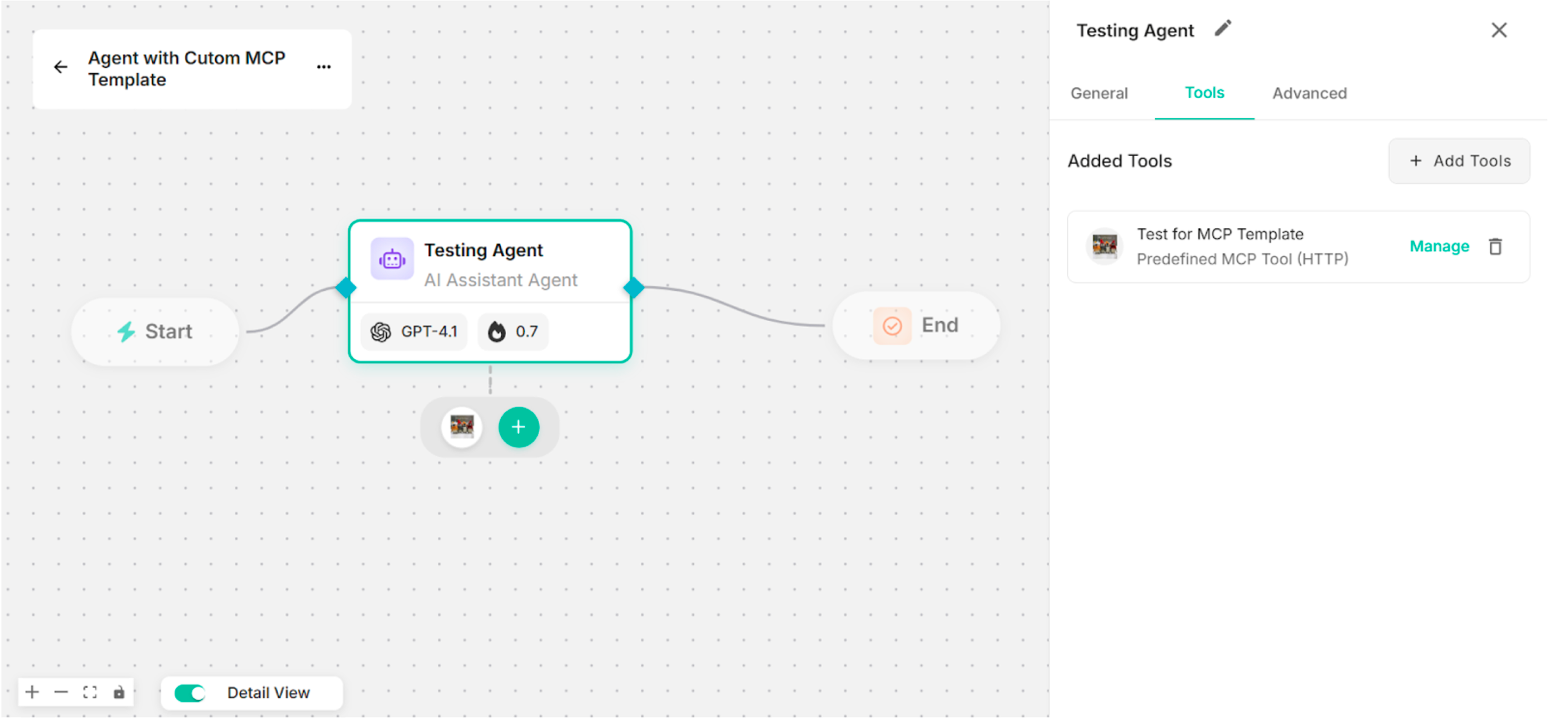 Figure: Created Custom MCP Template on Canvas
4.3. Advanced
The advanced section is used to configure input and output guard settings to ensure a safe and controlled AI chat experience. There are two types of guards:
- Input Guard – Controls and validates user inputs.
- Output Guard – Regulates the agent's responses.
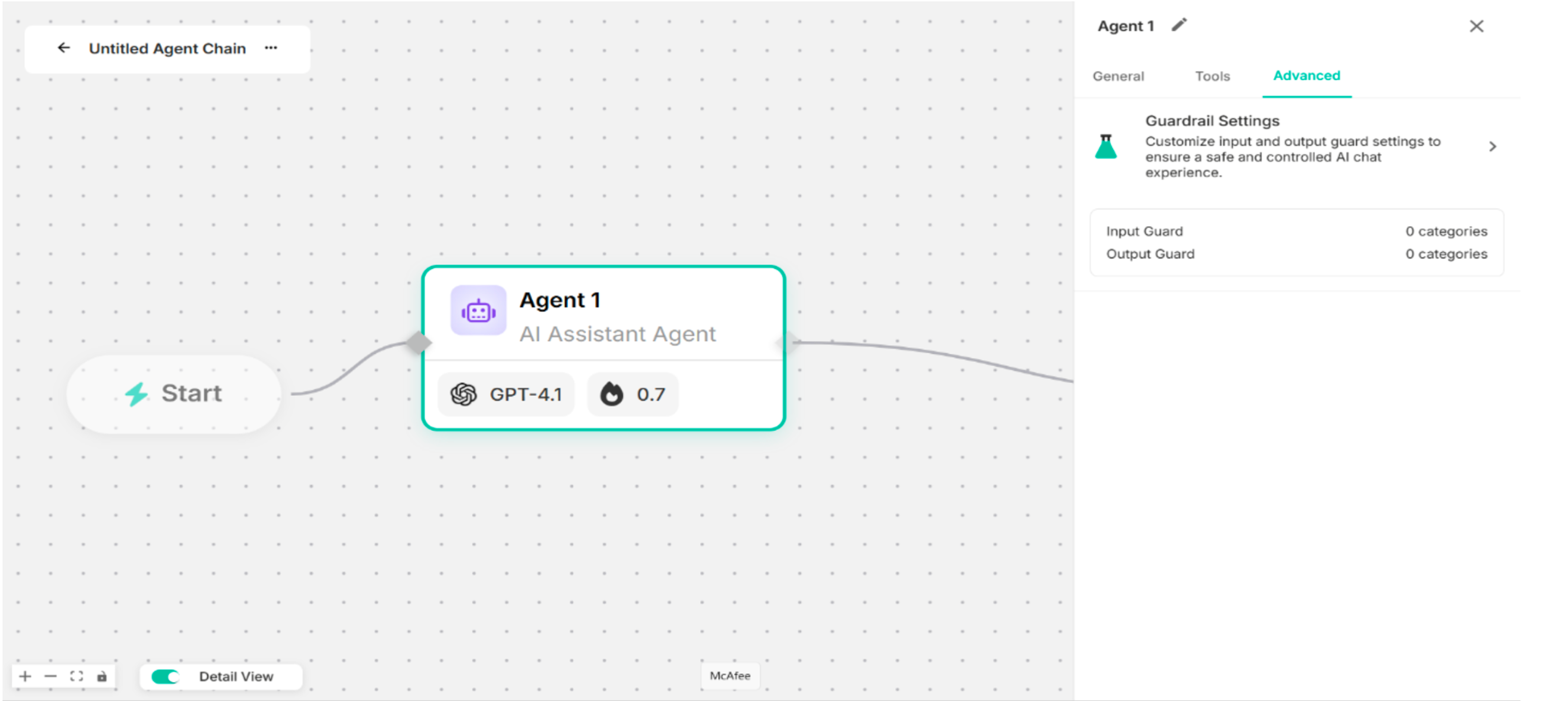 Figure: Advanced Configuration Drawer
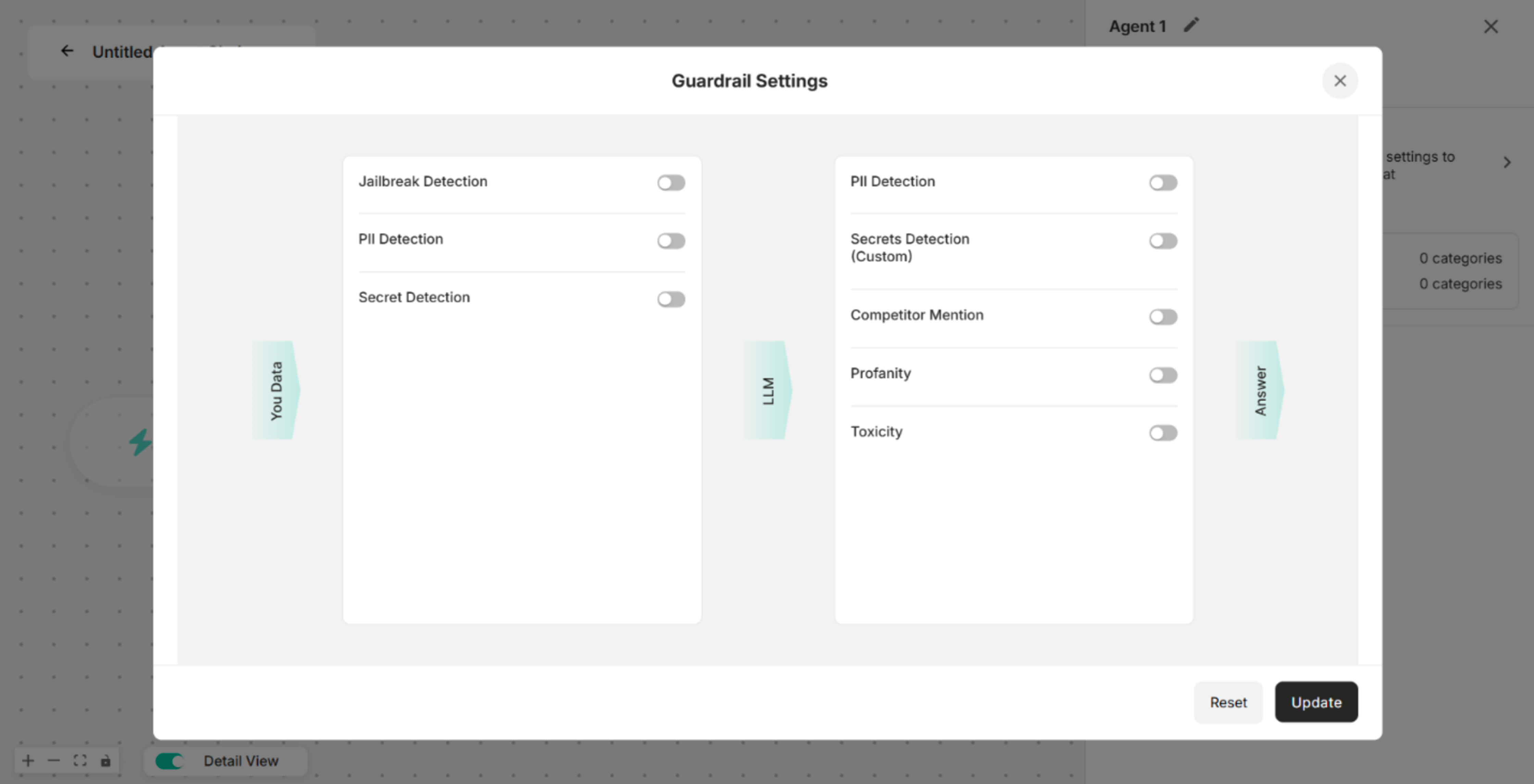 Figure: Guardrail Settings Pop-up
| Buttons | Description |
|---|---|
| Reset | To get back the original condition |
| Update | To save the guardrails changes |
| Cross (x) | To close the Guardrail Settings Pop-up Box |
| Input Guard | Description |
|---|---|
| Jailbreak Detection | Detects and blocks attempts to bypass or manipulate the agent's safety mechanisms. |
| PII Detection | Identifies any Personally Identifiable Information (PII) in the user input. |
| Secret Detection | Detects sensitive data like credentials, API keys, or custom-defined secrets in the input. |
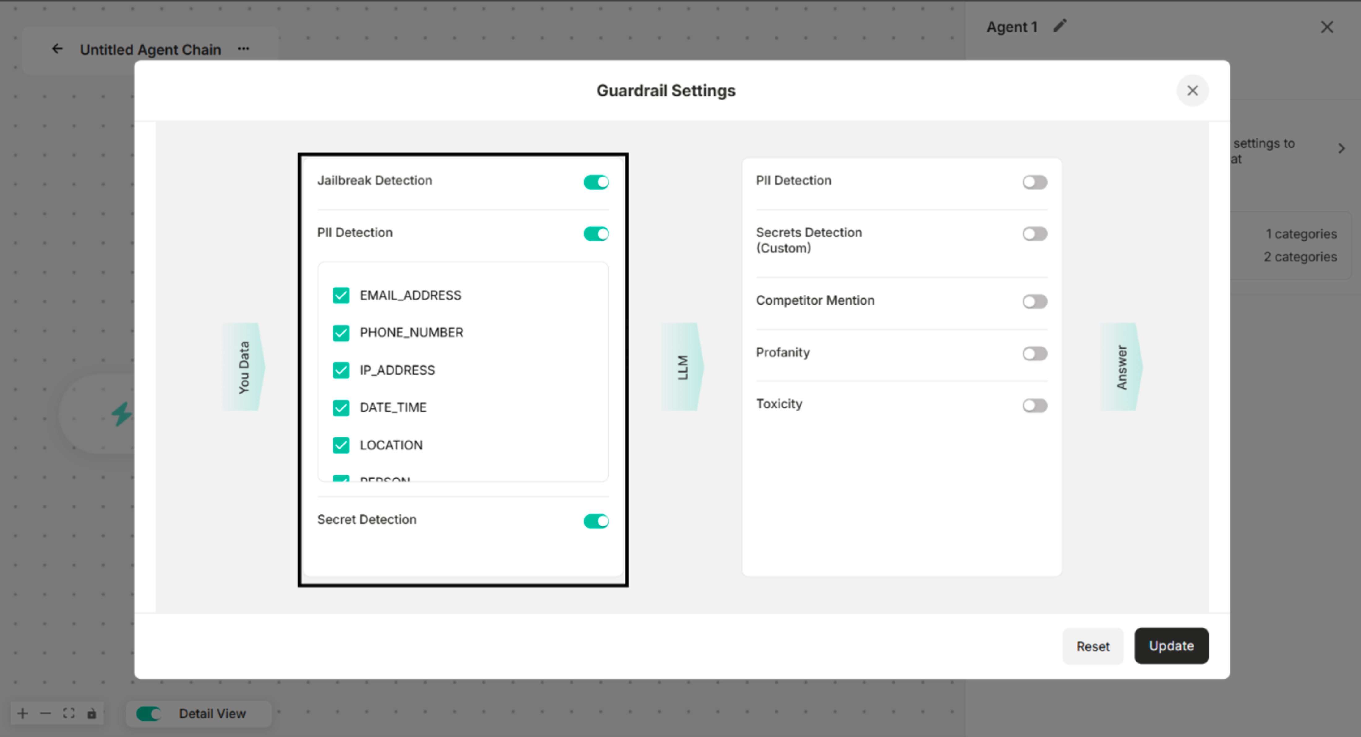 Figure: All Input Guards are enabled in Guardrail Settings
| Output Guard | Description |
|---|---|
| PII Detection | Detects and removes any Personally Identifiable Information from the agent's response. |
| Secrets Detection | Identifies and blocks the response of confidential or custom-defined sensitive information. |
| Competitor Mention | Prevents the agent from mentioning competitor names or related information. |
| Profanity | Detects and filters out offensive or vulgar language. |
| Toxicity | Flags and blocks toxic, harmful, or abusive content in the agent's response. |
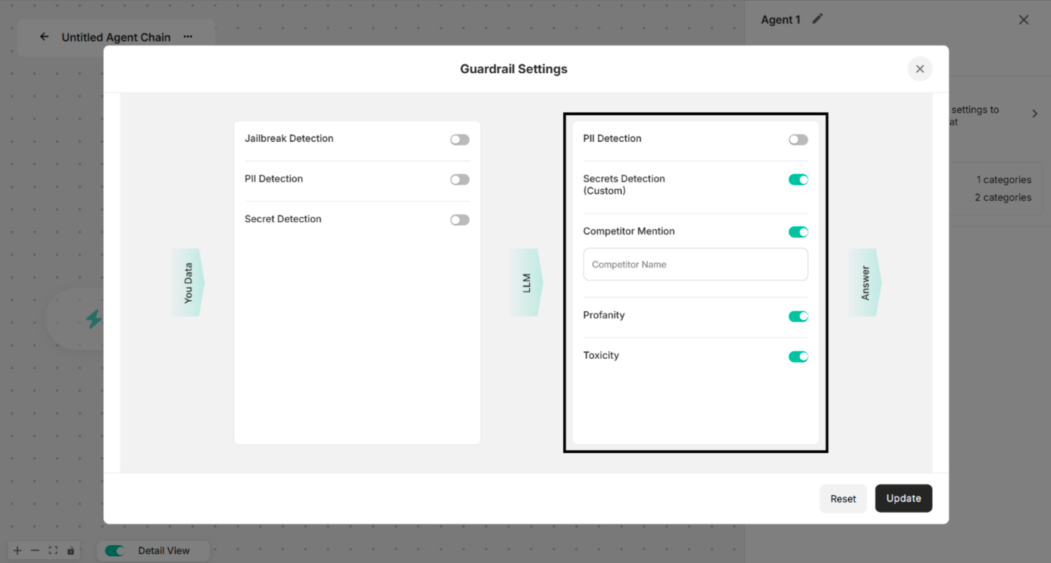 Figure: Output Guard in Guardrail Settings
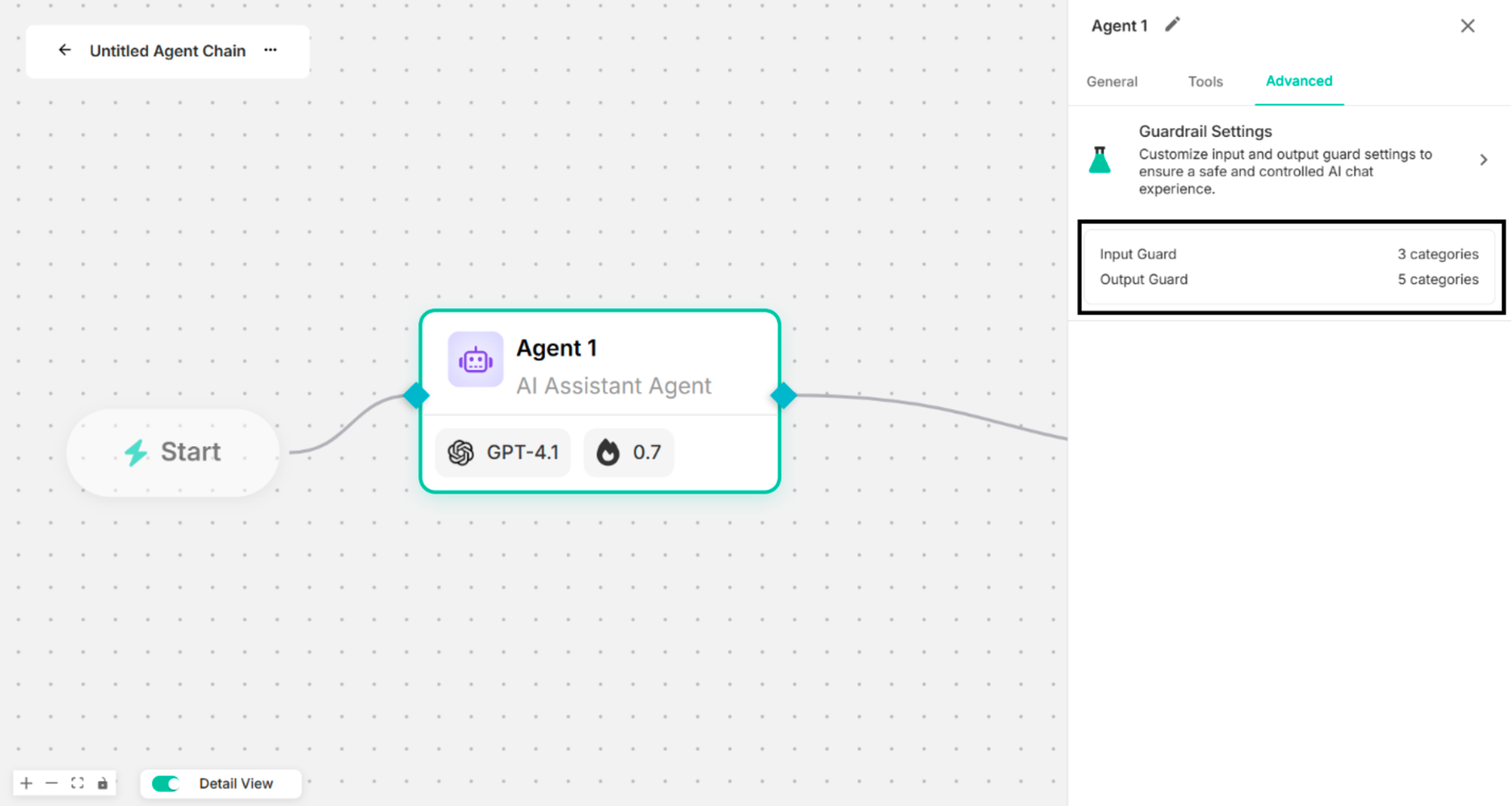 Figure: Advanced Configuration Drawer after applying Input and Output Guards